- Posts: 4403
- Forum
- News, Announcements and Feedback
- Feedback & Questions
- Devo7e/10 users: Do you configure the main screen?
Devo7e/10 users: Do you configure the main screen?
- PhracturedBlue
-
Topic Author
- Offline
I am now trying to figure out what to do about the devo7e/10.
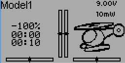
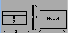
I can port the same interface I'm using on the Devo8 to the 128x64 screen. I already have it working to some extent:
However, I'm realizing that the 128x64 screen is much more limited than the higher-res screen as far as a configurable display goes.
So I'm wondering what the current usage is.
Do you actually modify the screen layout? I don't mean changing what sources are in what boxes, I mean changing from inside to outside trims; configuring more boxes and forgoing the model icon; etc
Do you wish you could place more toggle icons than you can today?
Do you want more configurability on the main screen, and for what purpose?
Finishing up the work I'm doing isn't too much work, but the interface isn't as convenient as on the color screens, and so I'm not sure it is a good tradeoff vs a more limited solution like the one that is currently available on the Devo10/7e.
Please Log in or Create an account to join the conversation.
- FDR
-
- Offline
Sorry, everybody!
I moved this thread to an other forum, so now you can post repies...
Please Log in or Create an account to join the conversation.
- Scream
-
- Offline
- Posts: 73
Devo 10 addict here... IMHO the screen is used to setup and to verify if I'm ready to fly. When I'm at the field, strapped in...cant barely see the screen so I'd like to fiddle around at that point as little as possible.
That means the more condensed info I can have at once the happier I am.
Model Icons are nice, but considering how limited they are I don't use them. I'd rather know the outputs of the channels at a glance so I can quickly verify the current model parameters...
As for swapping around boxes & layouts, I'd bet everyone has their own personal preferences, but don't change them once they figure out what's most comfortable to them. Except for the name at the top left; all my models look the same
I'd like to take a moment to plea/beg and possibly bribe for the possibilities of having more than 4 toggle boxes! PLEASE!
For example, instead of dials, its slightly more practical for me to use the "unused" trim buttons (from trims menu) for fine tuning the gyro on 300x(IMHO)... would be cool if I could see another toggle box (custom icon) to show that i'm not in a fixed mode without having to sacrifice knowing if TH is on, which Fmode im in and which mix mode i'm in.
Also while on the subject of trim buttons... would it be possible to make the trim buttons access the menus 1-4 that currently don't work in devo10 (probably doesn't work in other non color screens too)?
AS far as investing effort to allow B&W screens to have similar functionality... why don't we get a thread where we post our main screens... most common format wins? I'd rather it stays as is, but moving forward I'd sacrifice configurability for enhanced functionality.
Thanks & Happy Summertime fellow DevIAtes!
-=S=-
Cheers!
-=S=-
Please Log in or Create an account to join the conversation.
- PhracturedBlue
-
Topic Author
- Offline
- Posts: 4403
I don't recommend loading this code on a real tx yet, but I'd appreciate feedback on the interface.
The binary is here:
bitbucket.org/PhracturedBlue/deviation-newgui/downloads
Any feedback should be reported in the following thread to keep it all together:
www.deviationtx.com/forum/7-development/1899-pb-s-newgui
You can now have as many toggle icons as you like
Please Log in or Create an account to join the conversation.
- Scream
-
- Offline
- Posts: 73
I feel like its xmas in June, thanks!
I confess, I've never used the emu before... tried the link and not sure what i'm supposed to do...
Will these features be in a nightly soon? I think the last update I did was when 3.0 was official, so I'm due for a fight with dfuse
Cant wait for extra toggels! Now where did I put those toggle icons I made in may??
Cheers!
-=S=-
Cheers!
-=S=-
Please Log in or Create an account to join the conversation.
- RandMental
-
- Offline
- Posts: 521
Trims, in their traditional role, are not used on FBL heli's, so I like Screams idea to use them for other functions - therefore I second the need for more Switch Icon options to show these statuses.
NB: Using a trim button as analogue/proportional input to change gyro gain on the fly would be a great use with the gyro gain shown on the mains screen with the timers. (this might be possible already - still need to try the setup)
Edit: I like the new way of being able to move the boxes and placement around - a big yes, it works great!
Please Log in or Create an account to join the conversation.
- PhracturedBlue
-
Topic Author
- Offline
- Posts: 4403
Download the zip file for he devo10, unzip it run the executable. Of ocurse that assumes you have Windows or Wine.Scream wrote: I confess, I've never used the emu before... tried the link and not sure what i'm supposed to do...
Will these features be in a nightly soon? I think the last update I did was when 3.0 was official, so I'm due for a fight with dfuse
I'm seeing some instability issues on the devo10 emulator that I need to resolve before I recommend putting it on a real Tx. I also need to figure out what to do about the devo7e, since I'm now officially out of space.
But we can continue discussion of the features on the other thread.
Please Log in or Create an account to join the conversation.
- domcars0
-
- Offline
- Posts: 390
Just tried the new (emu) Devo10 GUI ...
It's crazy !! Not sure that it's really usefull but it's fun
May be a bug : After configured and moved two toggle icons, emu crashed
while escaping to the main page ....
DEBUG: LCD_DrawWindowedImageFromFile: Image not found: (null)
DEBUG: LCD_DrawWindowedImageFromFile: Image not found: (null)
Incident de segmentation (core dumped)
Devo 10 (+7e) owner. It's mine, please don't touch it with your big fingers
Please Log in or Create an account to join the conversation.
- Daryoon
-
- Offline
- Posts: 260
Do we plug our radio into it via trainer port?
Please Log in or Create an account to join the conversation.
- FDR
-
- Offline
You can find the hotkeys in the documentation...
Please Log in or Create an account to join the conversation.
- notyet
-
- Offline
- Posts: 25
Please Log in or Create an account to join the conversation.
- mwm
-
- Offline
As others have noted, looking at the screen when you're actually flying is rare, and happens quickly. Which means it's crucial to have all the information you're liable to need while flying on it. I haven't seen a need for more yet, but I'm using the 7E so far.
Do not ask me questions via PM. Ask in the forums, where I'll answer if I can.
My remotely piloted vehicle ("drone") is a yacht.
Please Log in or Create an account to join the conversation.
- RoGuE_StreaK
-
- Offline
- Posts: 486
Just so you know you are at least in the right ballpark for your chosen model
Please Log in or Create an account to join the conversation.
- myxiplx
-
- Offline
- Posts: 54
I agree with the others in that I'm not going to watch the screen often during flight, but I like to have a selection of figures in there so I can keep an eye on things, and I would definitely use this to add more to the screen.
I use all four toggles already (Throttle hold, lower rates, Fmode 1, Fmode 2), straight away I will want to increase this to use 6:
- Throttle hold
- Low rates
- Flight mode 1 / 2 / 3
- Gyro mode
Thinking about what's possible with this, could I add a couple of feature requests for the future:
- Three way toggle
- Plan text toggle field
Three way toggles would be great for any three way switches, namely flight mode.
If it's possible being able to enter our own text to display when switches are toggled, that would be great. I could see me preferring that to icons, and it would let me use a layout something like:
Left hand side (general setup + pre-flight):
- Model name
- Flight mode
- Gyro mode
- Throttle hold
Right hand side (in-flight figures):
- Timers
- Throttle position
- Battery voltage
- Gain
Please Log in or Create an account to join the conversation.
- Scream
-
- Offline
- Posts: 73
This is very cool bro! What other crazy stuff do you have in your bag o' tricks? If I find out that you have an auto-level feature similar to IKON that you aren't releasing... I'll be very upset sir!
The emu crashes almost as fast as me on my maiden 300x run and it seems mostly coming back from preview mode. OK, not that fast, but tried a few dozen times and always crashed so I don't have anything useful to contribute except encouragement!
I can move boxes around, seems like I can add toggels at will... awesome work!!! Love this concept!
Version 3.2 where art thou!?
Thanks!
-=S=-
Cheers!
-=S=-
Please Log in or Create an account to join the conversation.
- domcars0
-
- Offline
- Posts: 390
Hi,myxiplx wrote: ...
I use all four toggles already (Throttle hold, lower rates, Fmode 1, Fmode 2), straight away I will want to increase this to use 6:
- Throttle hold
- Low rates
- Flight mode 1 / 2 / 3
- Gyro mode
Thinking about what's possible with this, could I add a couple of feature requests for the future:
- Three way toggle
- Plan text toggle field
Three way toggles would be great for any three way switches, namely flight mode.
Not sure I understand you but can already use the same toggle indicator with
3 different icons to show the state of a 3 ways switches?
Devo 10 (+7e) owner. It's mine, please don't touch it with your big fingers
Please Log in or Create an account to join the conversation.
- myxiplx
-
- Offline
- Posts: 54
domcars0 wrote: Not sure I understand you but can already use the same toggle indicator with
3 different icons to show the state of a 3 ways switches?
Yes, you're right. I'd forgotten about that, I couldn't work it out earlier on, but somebody pointed out it's already supported.
Fixing feature requests before I even post them... these guys know their stuff
Please Log in or Create an account to join the conversation.
- Forum
- News, Announcements and Feedback
- Feedback & Questions
- Devo7e/10 users: Do you configure the main screen?
-
Home

-
Forum

-
News, Announcements and Feedback

-
Feedback & Questions

- Devo7e/10 users: Do you configure the main screen?


