- Posts: 8
Odd bold text in version 4.0.1
- Get to da choppa!
-
Topic Author
- Offline
After recently upgrading from 3.0.0 to 4.0.1, I have a couple of questions:
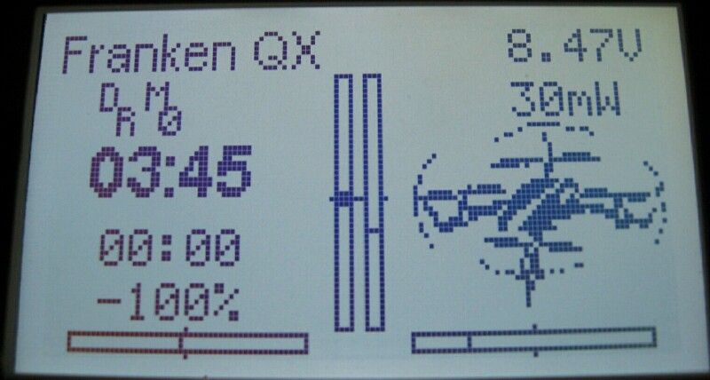
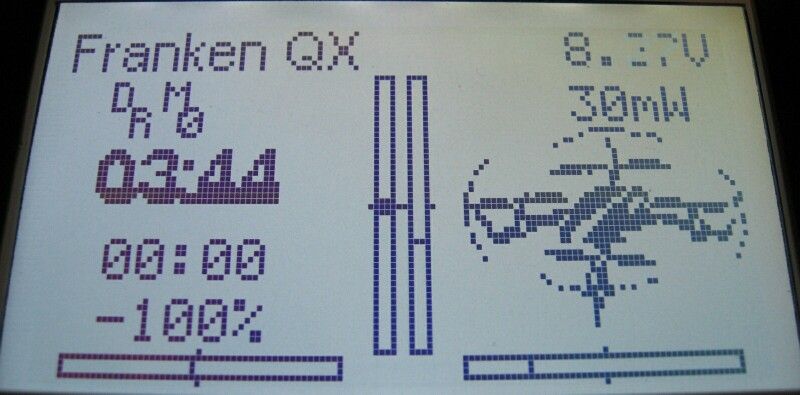
Boxes one, two, five and six on my Devo 10 display now show larger bold text that partially overlaps if not separated by an empty box. That's no problem in itself, but while the bold text starts out clearly legible, as in the top pic, the bottom line of pixels become obscured and somewhat difficult to read after the timers count down the first five seconds, as in the lower pic. Anyone else getting this?
The other question is, why does my "About Deviation" selection box from the main menu still display version 3.0.0 after my 4.0.1 upgrade? Did I miss something?
Thanks.
Please Log in or Create an account to join the conversation.
- rbe2012
-
- Offline
- So much to do, so little time...
- Posts: 1433
The version must show 4.0.1, otherwise you probably have still version 3.0.0 installed (possibly uploaded instead of upgrading? If so, get a new devo10.dfu and try again).
Please Log in or Create an account to join the conversation.
- WheresWaldo
-
- Offline
- Posts: 253
rbe2012 wrote: I am quite sure you must have missed something. I can't see the behavior you described.
The version must show 4.0.1, otherwise you probably have still version 3.0.0 installed (possibly uploaded instead of upgrading? If so, get a new devo10.dfu and try again).
He is still on 3.x, look at the battery/power it is too large. Also the trim display is wrong.
Please do the Upgrade again
Please Log in or Create an account to join the conversation.
- Get to da choppa!
-
Topic Author
- Offline
- Posts: 8
One more question: There's a debug zip folder with a Devo10.elf file in the 4.0.1 folder. How is that file utilized? The manual says "files with the extension zip, and dfu need not be copied," but if the .elf file isn't copied, what purpose does it serve?
Edit: tried a search on the .elf file. Apparently, it shouldn't be installed with the upgrade. Rather, it's used to facilitate error reports.
Please Log in or Create an account to join the conversation.
- WheresWaldo
-
- Offline
- Posts: 253
Please Log in or Create an account to join the conversation.
- Get to da choppa!
-
Topic Author
- Offline
- Posts: 8
I just took another stab at the upgrade and it all went smoothly this time. All my models survived intact (save for the switch icon settings; no big deal), the display looks as it should and everything works fine. I kinda miss that bold text when it was working correctly. It made it easier to see my timer at a glance while flying with the display dimmed. I thought it was a new feature, but I guess it was just an odd glitch.
I still don't know what went wrong the first time, but if it wasn't a brain fart, it may have been a Tx power glitch. My rechargeable AAs were on their last legs.
Please Log in or Create an account to join the conversation.
- RoGuE_StreaK
-
- Offline
- Posts: 486
From a quick experiment it appears that all three timers are linked, if you change media/config.ini ";Timer" to "font=14bold" you get it bigger and bolder but all three are that way and overlapping; not sure if you could move them around to not overlap.Get to da choppa! wrote: I kinda miss that bold text when it was working correctly. It made it easier to see my timer at a glance while flying with the display dimmed.
Unless I missed a spot where the first timer isn't linked to the other two? I think we need some documentation on the configs etc
Please Log in or Create an account to join the conversation.
- PhracturedBlue
-
- Offline
- Posts: 4403
There is a font for the small box and one for the big box. It has always been this way, and I don't recall changing it anytime within the past year, so I wouldn't expect fonts between 3.0 and 4.0 to be any different. there are no 'timer' specific fonts.
Please Log in or Create an account to join the conversation.
- RoGuE_StreaK
-
- Offline
- Posts: 486
actually I think I've misinterpreted something, does the ";" mean "don't include"?
I believe the line I changed which had an effect was in
[font-smallbox]
;Timer
  font=5x7
  font_color=FFFFFF
  bg_color=0
  box_type=fill
[EDIT] sorry was that saying that my comment was wrong, or the ";Timer" is a comment and is wrong?
Would be good to have this main timer addressable separately, either way
Please Log in or Create an account to join the conversation.
- PhracturedBlue
-
- Offline
- Posts: 4403
There is no support for different fonts for different datatypes in a box. I have no plans to add any such support.
Please Log in or Create an account to join the conversation.
- RoGuE_StreaK
-
- Offline
- Posts: 486
Please Log in or Create an account to join the conversation.
- rbe2012
-
- Offline
- So much to do, so little time...
- Posts: 1433
No need to change the config.ini, what could have unexpected results because the size of fonts is not used (tbh: at som paces it is..) to determine the size of boxes or labels.
The ";Timers" is a comment (starting with ";"). I personally think the config.inis delivered with Deviation should not contain those comments - documentation should be done elsewhere.
Please Log in or Create an account to join the conversation.
- WheresWaldo
-
- Offline
- Posts: 253
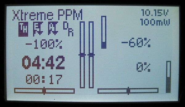
Copy this to the /layout directory while in USB mode on your Devo10, then from Main page config you can scroll to the last entry and load it. It will make the screen look similar to the one above, except display all 6 switches.
Modify it any way you like.
Please Log in or Create an account to join the conversation.
- Get to da choppa!
-
Topic Author
- Offline
- Posts: 8
Please Log in or Create an account to join the conversation.
- WheresWaldo
-
- Offline
- Posts: 253
Please Log in or Create an account to join the conversation.
- Get to da choppa!
-
Topic Author
- Offline
- Posts: 8
WheresWaldo wrote: ... post the code in the [gui-128x64] section of your model so you can share it with others.
Sorry - I've only been using Deviation for a few weeks, and haven't figured out how to do that. Using your uploaded ini file as an example, I tried opening up the Deviation model file in question, and I see the text info following the 128x64 section, but I don't know how to create the new .ini file for uploading. Do I just cut and paste the section of text to the notepad and save it with a .ini extension?
Here's the (I hope) relevant text:
[gui-128x64]
V-trim=54,10,1
H-trim=1,59,3
V-trim=61,10,2
H-trim=68,59,4
Small-box=2,22,Ch1
Small-box=2,48,Timer2
Battery=102,1
Toggle=5,10,0,72,0,RUD DR
Toggle=17,10,65,132,0,GEAR
Toggle=29,10,131,65,4,MIX
Toggle=41,10,6,69,132,FMODE
TxPower=102,8
Bargraph=71,6,Ch5
Bargraph=123,39,Ch6
Small-box=75,21,Ch5
Small-box=75,39,Ch6
Big-box=2,33,Timer1
quickpage1=Channel monitor
Thanks.
Please Log in or Create an account to join the conversation.
- WheresWaldo
-
- Offline
- Posts: 253
Please Log in or Create an account to join the conversation.
- Get to da choppa!
-
Topic Author
- Offline
- Posts: 8
Thanks again. I'm learning a lot, here.
Please Log in or Create an account to join the conversation.
- WheresWaldo
-
- Offline
- Posts: 253
Please Log in or Create an account to join the conversation.
- Get to da choppa!
-
Topic Author
- Offline
- Posts: 8
Please Log in or Create an account to join the conversation.
-
Home

-
Forum

-
News, Announcements and Feedback

-
Feedback & Questions

- Odd bold text in version 4.0.1


