Icon changes proposal
- FDR
-
Topic Author
- Offline
Less
More
06 Dec 2013 20:56 #16344
by FDR
Icon changes proposal was created by FDR
PB, I changed some icons to distinguish them more from the navigation buttons.
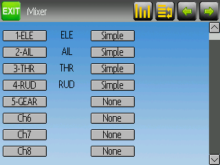
The first is the channel reorder, which always looked to me as a refresh button:
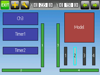
The second (and third) is on the main page layout page, however the wrench used is the same as the transmitter options on the main page, so they should be separated:
What do you think?
The first is the channel reorder, which always looked to me as a refresh button:
The second (and third) is on the main page layout page, however the wrench used is the same as the transmitter options on the main page, so they should be separated:
What do you think?
Please Log in or Create an account to join the conversation.
- PhracturedBlue
-
- Offline
Less
More
- Posts: 4403
07 Dec 2013 02:12 #16350
by PhracturedBlue
Replied by PhracturedBlue on topic Icon changes proposal
The 1st is good. Better than the one I used.
I don't see any difference between your 'main page config' and the current release. Are you saying you want an icon different than the wrench? if so, that is fine (it was always meant to imply 'config' so I saw no reason not to use the same one). If you have one you want to replace it with, let me know, and I'll split them up so they can be different.
I don't see any difference between your 'main page config' and the current release. Are you saying you want an icon different than the wrench? if so, that is fine (it was always meant to imply 'config' so I saw no reason not to use the same one). If you have one you want to replace it with, let me know, and I'll split them up so they can be different.
Please Log in or Create an account to join the conversation.
- FDR
-
Topic Author
- Offline
07 Dec 2013 09:18 - 07 Dec 2013 09:20 #16361
by FDR
Replied by FDR on topic Icon changes proposal
No I just changed their colors to orange to differentiate the "function" buttons from the green navigational ones. This way they popup more to the eyes.
Furthermore I changed their bacgroung to match, and made the plus a bit smaller too, but these are only cosmetic changes...
My concern was that the same options bitmap is used on the main page, which is green (and it looks better in green on the main page).
For better customizability it would be nice if they used different bitmaps...
Last edit: 07 Dec 2013 09:20 by FDR.
Please Log in or Create an account to join the conversation.
- PhracturedBlue
-
- Offline
Less
More
- Posts: 4403
07 Dec 2013 14:47 #16369
by PhracturedBlue
Replied by PhracturedBlue on topic Icon changes proposal
Sorry, my color blindness explains not noticing the difference between orange and green. I've split up the icons. feel free to submit a pull request with the updated icons.
Please Log in or Create an account to join the conversation.
- FDR
-
Topic Author
- Offline
07 Dec 2013 20:31 #16390
by FDR
Replied by FDR on topic Icon changes proposal
Thanks, I made the changes and sent the pull request...
Please Log in or Create an account to join the conversation.
Time to create page: 0.075 seconds
-
Home

-
Forum

-
News, Announcements and Feedback

-
News & Announcements

- Icon changes proposal


