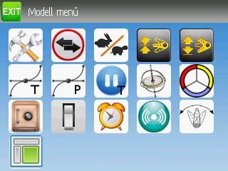
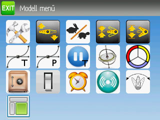
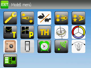
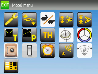
Simplified mixer's icons
- FDR
-
Topic Author
- Offline
There are basically three type of functions, which:
- define the model configuration (like: model config, reverse, subtrim, trim, travel adjust, swash config, throttle hold, failsafe, switch assignment);
- define the flying characteristics (dr & expo, throttle curves, pitch curves, gyro settings);
- optional settings (timers, telemetry alarms, main page configs).
I would draw 3D dark grey button background, just like on the header, and drawings (and/or one-two bold letters) on the face with three vivid colors (for example green, yellow, orange) to distinguish the three function group.
However then we should arrange the buttons according those functions/colors too...
What do you think?
Please Log in or Create an account to join the conversation.
- FDR
-
Topic Author
- Offline
Please Log in or Create an account to join the conversation.
- domcars0
-
- Offline
- Posts: 390
Devo 10 (+7e) owner. It's mine, please don't touch it with your big fingers
Please Log in or Create an account to join the conversation.
- FDR
-
Topic Author
- Offline
Please Log in or Create an account to join the conversation.
- domcars0
-
- Offline
- Posts: 390
Devo 10 (+7e) owner. It's mine, please don't touch it with your big fingers
Please Log in or Create an account to join the conversation.
- FDR
-
Topic Author
- Offline
Please Log in or Create an account to join the conversation.
- FDR
-
Topic Author
- Offline
Please Log in or Create an account to join the conversation.
- domcars0
-
- Offline
- Posts: 390
For rabbit/turtle I think you can paint them in white and keep the same background as others.
Devo 10 (+7e) owner. It's mine, please don't touch it with your big fingers
Please Log in or Create an account to join the conversation.
- RugWarrior
-
- Offline
- Posts: 59
I also like the gray/orange stuff more
Or is there a special reason for it?!
Please Log in or Create an account to join the conversation.
- FDR
-
Topic Author
- Offline
domcars0 wrote: Why did you change colors ? I don't like this flashy green very much ..
RugWarrior wrote: I also like the gray/orange stuff more
Or is there a special reason for it?!
Yep, there is a reason to group the different functions by color.
I wrote about that earlier:
FDR wrote: About the icons (before I spend too much time drawing them):
There are basically three type of functions, which:
- define the model configuration (like: model config, reverse, subtrim, trim, travel adjust, swash config, throttle hold, failsafe, switch assignment);
- define the flying characteristics (dr & expo, throttle curves, pitch curves, gyro settings);
- optional settings (timers, telemetry alarms, main page configs).
I would draw 3D dark grey button background, just like on the header, and drawings (and/or one-two bold letters) on the face with three vivid colors (for example green, yellow, orange) to distinguish the three function group.
However then we should arrange the buttons according those functions/colors too...
What do you think?
Please Log in or Create an account to join the conversation.
- RugWarrior
-
- Offline
- Posts: 59
Grouping is a good idea... it looks like I missed your post somehow
Please Log in or Create an account to join the conversation.
- domcars0
-
- Offline
- Posts: 390
Devo 10 (+7e) owner. It's mine, please don't touch it with your big fingers
Please Log in or Create an account to join the conversation.
- FDR
-
Topic Author
- Offline
Since the yellow and the orange happened to be almost identical, I have to select other colors, or abandon the grouping and make all orange...
What colors would you like them to be?
Please Log in or Create an account to join the conversation.
- domcars0
-
- Offline
- Posts: 390
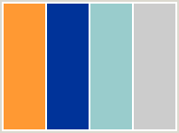
Take a look on this site www.colorcombos.com/ .. It's for web pages but I think it can be usefull.
An exemple :
I think you can use only 4 colors (orange, blue, black and white -with all greys ), and remember that you can invert the backgrounds , for exemple one group will have black/grey background with orange/white item and another will have it orange/white while item will be black/blue etc... Don't use too many colors .
Devo 10 (+7e) owner. It's mine, please don't touch it with your big fingers
Please Log in or Create an account to join the conversation.
- FDR
-
Topic Author
- Offline
It doesn't work for the menu icons so far (PB have to correct it), but as you can see it, on all the header buttons work like that...
Please Log in or Create an account to join the conversation.
- rbe2012
-
- Offline
- So much to do, so little time...
- Posts: 1433
I think the shaded gray/black background is nice and allows a wide range of foreground colors which are good to see.
Designing such things is not easy to me so I can only tell what I think and not what would be the best.
There should be some colors which can match good with the orange. Maybe a darker red, a light blue, a slightly darker green, pink. All these colors should appear like the orange - not too light, sufficient contrast.
I would make the green slightly darker and choose a blue maybe like this: BLUE as third color. Also I would try to "reverse" the icons with the white background and also the inner of the clock so the icons would look more "corporate".
Please Log in or Create an account to join the conversation.
- domcars0
-
- Offline
- Posts: 390
For me a pressed button is just a light (luminosity) effect, not a color inversion ?FDR wrote: I cannot use inverting, because it is already used for the pressed state.
Devo 10 (+7e) owner. It's mine, please don't touch it with your big fingers
Please Log in or Create an account to join the conversation.
- FDR
-
Topic Author
- Offline
domcars0 wrote:
For me a pressed button is just a light (luminosity) effect, not a color inversion ?FDR wrote: I cannot use inverting, because it is already used for the pressed state.
I said it doesn't work for the menu icons yet.
Click on any header button like tx menu, exit, left/right, etc, and hold on a bit to see.
The menu icons will work the same...
Please Log in or Create an account to join the conversation.
- domcars0
-
- Offline
- Posts: 390
Ah yes, I see .. I don't like how it looks .. for me, Press/Unpress button would be nicer like this:FDR wrote:
I said it doesn't work for the menu icons yet.
Click on any header button like tx menu, exit, left/right, etc, and hold on a bit to see.
The menu icons will work the same...
or/and
or/and
Light have to come from the top for all the button icons... A real physical button does'nt invert his color when we push on it
But I don't have a devo8
Devo 10 (+7e) owner. It's mine, please don't touch it with your big fingers
Please Log in or Create an account to join the conversation.
- FDR
-
Topic Author
- Offline
Please Log in or Create an account to join the conversation.
-
Home

-
Forum

-
General

-
General Discussions

- Simplified mixer's icons

