
- Posts: 4403
New site theme (please provide feedback)
- PhracturedBlue
-
Topic Author
- Offline
Less
More
20 Mar 2015 13:59 - 20 Mar 2015 14:03 #29931
by PhracturedBlue
New site theme (please provide feedback) was created by PhracturedBlue
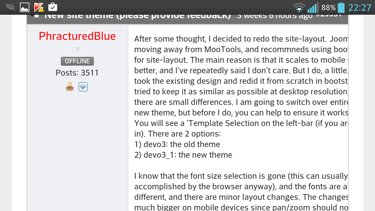
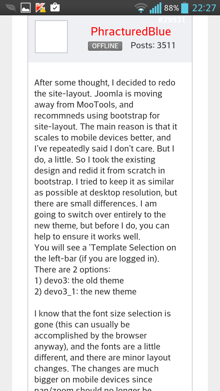
After some thought, I decided to redo the site-layout. Joomla is moving away from MooTools, and recommneds using bootstrap for site-layout. The main reason is that it scales to mobile devices better, and I've repeatedly said I don't care. But I do, a little. So I took the existing design and redid it from scratch in bootstrap. I tried to keep it as similar as possible at desktop resolution, but there are small differences. I am going to switch over entirely to the new theme, but before I do, you can help to ensure it works well.
You will see a 'Template Selection on the left-bar (if you are logged in). There are 2 options:
1) devo3: the old theme
2) devo3_1: the new theme
I know that the font size selection is gone (this can usually be accomplished by the browser anyway), and the fonts are a little different, and there are minor layout changes. The changes are much bigger on mobile devices since pan/zoom should no longer be needed.
I am interested in any issues you have with the new theme at any resolution (please specify the device you are viewing on). If you see something that doesn't look right, or just want to gripe, here is the place for it.
To reiterate, the old theme will go away (as will the template-selection box) so now is your opportunity to make sure the theme works
Last edit: 20 Mar 2015 14:03 by PhracturedBlue.
- IMback!
-
- Offline
Less
More
- Posts: 84
20 Mar 2015 14:23 - 20 Mar 2015 14:29 #29932
by IMback!
Replied by IMback! on topic New site theme (please provide feedback)
Honestly
I don't like it at all (on mobile). There is a boarder around the site that wastes space. When the left hand menu is expanded the deviation logo becomes miss aligned and looks messy. I don't like that there is just one collum on the forum index. And genneraly the old desktop site is more useable (clicks needed to get from a to b) on mobile. For instance to get to the "links" link all I had to do previously was scroll to the left, now I have to scroll all the way to the top and then down again. When not logged in on the new site, due to the missing collums in the forum I have to visit a sub forum to figure out if I have already read a post. I also generally agree with your previous sentiment about mobile forum use, comment quality and so on.
I know the Colloms appear on larger devices, they don't on my 1920x1080 xperia z in portrait. they used to on the old site and where of good size. I think this is a regression
On the desktop the site appears fine.
Last edit: 20 Mar 2015 14:29 by IMback!.
- FDR
-
- Offline
20 Mar 2015 14:36 - 20 Mar 2015 14:37 #29935
by FDR
Replied by FDR on topic New site theme (please provide feedback)
I do not agree.
The forum list is multicolumn if you switch to landscape view, but at least usable in both views.
I barely touch the side menu in everyday usage anyway.
I tried it with Chrome mobile, and the logo is fine even when the left menu is expanded.
However it is true, that the grey side borders are useless and take up usable space...
Afterall IMO it is more usable on a mobile device then it was before...
Last edit: 20 Mar 2015 14:37 by FDR.
- IMback!
-
- Offline
Less
More
- Posts: 84
20 Mar 2015 14:46 - 20 Mar 2015 14:51 #29937
by IMback!
Replied by IMback! on topic New site theme (please provide feedback)
The logo is fine actually but the site expands, the logo dose not witch causes the logo to no loger be in the middle and no loger be as wide as the rest of the page. Also on the non-crome stock android browser on every view except the forum view the text expands into the gray border when the side menu is expanded
An option to make the site always use the desktop version when logged in would make me happy. (or ill change my user agent for this site)
An option to make the site always use the desktop version when logged in would make me happy. (or ill change my user agent for this site)
Last edit: 20 Mar 2015 14:51 by IMback!.
- FDR
-
- Offline
20 Mar 2015 14:55 #29938
by FDR
Replied by FDR on topic New site theme (please provide feedback)
I think that is by design.
I took a look on the default browser, and it behaves almost the same as Chrome did.
There are small glitches in both: on the left grey border there are some residue from the side menu, but it isn't a big deal.
Afterall it is still not a mobile application, but only a different rendering for mobile devices...")
I took a look on the default browser, and it behaves almost the same as Chrome did.
There are small glitches in both: on the left grey border there are some residue from the side menu, but it isn't a big deal.
Afterall it is still not a mobile application, but only a different rendering for mobile devices...
- PhracturedBlue
-
- Offline
Less
More
- Posts: 4403
20 Mar 2015 15:03 #29940
by PhracturedBlue
Replied by PhracturedBlue on topic New site theme (please provide feedback)
I agree the slide isn't pretty. I am not sure it is fixable. I could get rid of it and put it on the bottom, or have it pop-up a new menu. It really shouldn't be used that often, so the whole point was to hide it when the page gets too narrow.
I never visit the index page (I just browse 'Recent'. Honestly, I'm not even sure why we have categories other than it makes search a little easier).
I am not sure how bootstrap detects the browser info. I thought it was purely based on screen width. On my S3, in landscape mode, it looks just like it does on desktop. In portrait, the columns disappear and the text is visible. Getting rid of the border on mobile is probably a good idea though. One of the issues with 'mobile enabled' sites is that effectively they snap to one of 4 predefined layouts (see here: getbootstrap.com/2.3.2/scaffolding.html#responsive )
- PhracturedBlue
-
- Offline
Less
More
- Posts: 4403
20 Mar 2015 17:26 #29955
by PhracturedBlue
Replied by PhracturedBlue on topic New site theme (please provide feedback)
This is a crude hack, but see if this helps:
to force desktop mode click this link:
www.deviationtx.com/forum/index?screenMode=desktop
to go back, click this link:
www.deviationtx.com/forum/index?screenMode=none
It should be sticky for 'a while'. If it solves your needs, I'll make it into a cookie, and add a setting somewhere
to force desktop mode click this link:
www.deviationtx.com/forum/index?screenMode=desktop
to go back, click this link:
www.deviationtx.com/forum/index?screenMode=none
It should be sticky for 'a while'. If it solves your needs, I'll make it into a cookie, and add a setting somewhere
- IMback!
-
- Offline
Less
More
- Posts: 84
20 Mar 2015 18:17 #29956
by IMback!
Replied by IMback! on topic New site theme (please provide feedback)
Thats nice, i like it. A cookie or setting is not necessary? I could just changing my bookmark to
www.deviationtx.com/forum/index?screenMode=desktop
?
- sbstnp
-
- Offline
Less
More
- Posts: 649
20 Mar 2015 19:07 #29959
by sbstnp
Devo 10 + 4in1
Spektrum Dx9
FrSky Taranis + TBS Crossfire
Replied by sbstnp on topic New site theme (please provide feedback)
I like it. I've used bootstrap on a number of projects and it is quite flexible. Currently the site doesn't look exactly great on mobile, but ok on the desktop. I guess with a bit of work the mobile version could be quite usable.
Devo 10 + 4in1
FrSky Taranis + TBS Crossfire
- PhracturedBlue
-
- Offline
Less
More
- Posts: 4403
20 Mar 2015 20:05 #29963
by PhracturedBlue
Replied by PhracturedBlue on topic New site theme (please provide feedback)
I haven't set a cookie yet. It is using session variables (which is why I said it'll last 'a while'). If it seems to work well though, I will add a cookie for it too.IMback! wrote: Thats nice, i like it. A cookie or setting is not necessary? I could just changing my bookmark to www.deviationtx.com/forum/index?screenMode=desktop ?
- PhracturedBlue
-
- Offline
Less
More
- Posts: 4403
20 Mar 2015 20:08 #29964
by PhracturedBlue
While I am 'eating my own dogfood' and using the new template exclusively, I won't remove the old template until it looks ok.
At the same time, I primarily use a desktop for navigation, so I definitely want feedback on issues you run into.
Replied by PhracturedBlue on topic New site theme (please provide feedback)
Yes the mobile side is not done yet. The slide menu really is ugly (as mentioned) and the button doesn't overlap the logo properly. I am new to bootstrap, and documentation seems to all be ver3 based (for instance I haven't found a good tutorial on how to make the slide-menu work properly with version 2 which is what Joomla uses)sbstnp wrote: I like it. I've used bootstrap on a number of projects and it is quite flexible. Currently the site doesn't look exactly great on mobile, but ok on the desktop. I guess with a bit of work the mobile version could be quite usable.
While I am 'eating my own dogfood' and using the new template exclusively, I won't remove the old template until it looks ok.
At the same time, I primarily use a desktop for navigation, so I definitely want feedback on issues you run into.
- PhracturedBlue
-
- Offline
Less
More
- Posts: 4403
20 Mar 2015 21:25 #29965
by PhracturedBlue
Replied by PhracturedBlue on topic New site theme (please provide feedback)
I changed the css, and now:
The menu button is always at the top left and will overlap the logo
The menu is not visible in the background when it is minimized
The screen is properly clipped when the menu is expanded.
Let me know what else is broken.
The menu button is always at the top left and will overlap the logo
The menu is not visible in the background when it is minimized
The screen is properly clipped when the menu is expanded.
Let me know what else is broken.
- PhracturedBlue
-
- Offline
Less
More
- Posts: 4403
07 Apr 2015 20:46 #30887
by PhracturedBlue
Replied by PhracturedBlue on topic New site theme (please provide feedback)
If you haven't noticed, I have installed the new mobile-enabled theme as default now. There is no longer any supported method to use the old theme. I did add a new link at the very bottom of the page that will allow forcing Desktop mode even on small screens (or resetting it if you have previously set it).
If you see any issues, please let me know.
If you see any issues, please let me know.
- Thomas.Heiss
-
- Offline
Less
More
- Posts: 698
10 Apr 2015 01:09 #30964
by Thomas.Heiss
Replied by Thomas.Heiss on topic New site theme (please provide feedback)
Hello PhracturedBlue,
I very much like the new layout.
Works great on Blackberry Bold 9780.
Recent posting is fine - gives good overview.
Previous always cut width and only showed part of posting.
Only expanded table to the right when you searched
In text..
True for the white border around the tables.
What I miss a bit:
Date+time of first and following postings in a thread.
Greetings
Thomas
- linux-user
-
- Offline
Less
More
- Posts: 271
10 Apr 2015 06:34 - 10 Apr 2015 06:34 #30976
by linux-user
In Landscape-mode the Date+time is visible.
Android 4.3
Replied by linux-user on topic New site theme (please provide feedback)
True only for portrait-modeThomas.Heiss wrote: What I miss a bit:
Date+time of first and following postings in a thread.
In Landscape-mode the Date+time is visible.
Android 4.3
Last edit: 10 Apr 2015 06:34 by linux-user.
- FDR
-
- Offline
10 Apr 2015 19:48 #31009
by FDR
Replied by FDR on topic New site theme (please provide feedback)
Chrome has difficulties on my Android based phone: in landscape mode the right side of the forum posts is cut while it is fine in portrait mode and in the default Android browser as well.
Can somebody verify my findings?
Can somebody verify my findings?
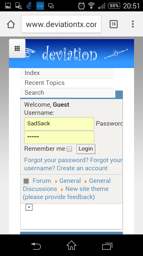
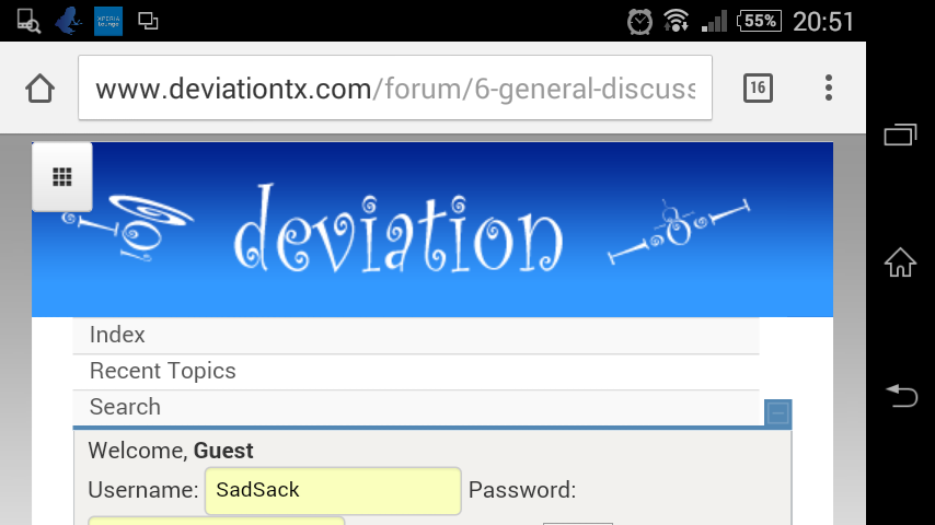
- SadSack
-
- Offline
Less
More
- Posts: 317
10 Apr 2015 19:53 - 10 Apr 2015 19:54 #31010
by SadSack
Replied by SadSack on topic New site theme (please provide feedback)
Google Sony E3
Last edit: 10 Apr 2015 19:54 by SadSack.
- FDR
-
- Offline
10 Apr 2015 20:47 #31011
by FDR
Replied by FDR on topic New site theme (please provide feedback)
No, I mean this:
...while the portrait mode is fine:
(It took me a while to find a screenshot sw that actually works...)
...while the portrait mode is fine:
(It took me a while to find a screenshot sw that actually works...)
- TomPeer
-
- Offline
Less
More
- Posts: 303
10 Apr 2015 20:50 #31012
by TomPeer
Replied by TomPeer on topic New site theme (please provide feedback)
works fine on my note4 |(android 4.4) with chrome.
- SadSack
-
- Offline
Less
More
- Posts: 317
10 Apr 2015 20:58 #31013
by SadSack
Replied by SadSack on topic New site theme (please provide feedback)
sorry but mines fine, no clipping looks fine.
Chrome / 4.4.4 - Rooted. Stock browser not installed.
Chrome / 4.4.4 - Rooted. Stock browser not installed.
Time to create page: 0.153 seconds
-
Home

-
Forum
-
General
-
General Discussions
- New site theme (please provide feedback)