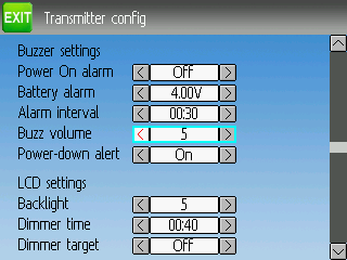
Test of the new menu system
- FDR
-
Topic Author
- Offline
My tests are primarily done in the emu_devo8 (deviation-emu_devo8-v5.0.0-969e9d5), I will make a note otherwise.
Please Log in or Create an account to join the conversation.
- FDR
-
Topic Author
- Offline
The "Transmitter menu", which in default needs no scrollbar to show all the items will unexpectedly show the scrollbar if I step through the buttons to the last from top down, but it doesn't happen if I step through upwards.
EDIT: The model menu behaves the same...
FIXED in ec6456a...
Please Log in or Create an account to join the conversation.
- FDR
-
Topic Author
- Offline
Please Log in or Create an account to join the conversation.
- FDR
-
Topic Author
- Offline
Now it quickly iterates through the pages backward until the main menu, but then you need to press it again to go back to the main page.
FIXED in ec6456a...
Please Log in or Create an account to join the conversation.
- FDR
-
Topic Author
- Offline
In the original 4.0.1 it was there, but in a later nightly it has gone, as well as the big graph opening with a click on the small graph...
FIXED in 6e1597a...
Please Log in or Create an account to join the conversation.
- PhracturedBlue
-
- Offline
- Posts: 4403
I'm currently in the process of making things much worse (replacing the listbox with a scrollable which is resulting in lots of new bugs). Once I'm done with that, I'll start working on making them better again
But please don't stop reporting findings, knowning what is not right makes it a lot easier to fix.
Please Log in or Create an account to join the conversation.
- FDR
-
Topic Author
- Offline
Please Log in or Create an account to join the conversation.
- PhracturedBlue
-
- Offline
- Posts: 4403
I have now (I think) enabled all pages to be functional with the buttons only. How the buttons react will be different on the load/save/icon/reorder pages because I rewrote the code to use a scrollable widget.
I need some attention for the mixer reorder page. I have a scroll list on the right as before, but it is now view-only. This is primarily because I didnt' lie the previous interface where the sue of 'Copy to' was non-intuitive. Now the textselects do all the work, and the list is only for visualization of the current order. But I don't love this solution either and welcome feedback. I was considering allowing only touch select (no button control) of the list, but the widgets can't easily support that system, so I've abandoned it.
I added the long-press EXT to main menu already. I'll start looking at regressions and other oddities shortly.
Please Log in or Create an account to join the conversation.
- PhracturedBlue
-
- Offline
- Posts: 4403
Please Log in or Create an account to join the conversation.
- FDR
-
Topic Author
- Offline
Please Log in or Create an account to join the conversation.
- FDR
-
Topic Author
- Offline
FIXED in 6e1597a...
Please Log in or Create an account to join the conversation.
- FDR
-
Topic Author
- Offline
PhracturedBlue wrote: I think I've addressed all items listed in this thread so far...I'm about ready to release this into the trunk. Maybe tomorrow.
FIXED in 07349c2...
This one has FIXED in 6e1597a...
Please Log in or Create an account to join the conversation.
- FDR
-
Topic Author
- Offline
FIXED in 07349c2...
Please Log in or Create an account to join the conversation.
- FDR
-
Topic Author
- Offline
FIXED in 07349c2...
Please Log in or Create an account to join the conversation.
- FDR
-
Topic Author
- Offline
Please Log in or Create an account to join the conversation.
- FDR
-
Topic Author
- Offline
Furthermore the scroll bar doesn't work, even if there are more then 8 channels.
Please Log in or Create an account to join the conversation.
- FDR
-
Topic Author
- Offline
FIXED in 07349c2...
Please Log in or Create an account to join the conversation.
- FDR
-
Topic Author
- Offline
EDIT: The soultion could be that the short click only previews the icon and the long click selects it and closes the form. Drawback is that it wouldn't be obvious, how to select an icon with the touch screen. There should be a Load, (or Select, or OK) button for that. However then we should include it into the "tab order" too, which would complicate the otherwise simple selection with the buttons...
EDIT: The same is true for the model select page too. You can't preview the model by it's icon, because it is immediately selected...
FIXED in 07349c2...
Please Log in or Create an account to join the conversation.
- FDR
-
Topic Author
- Offline
Please Log in or Create an account to join the conversation.
- FDR
-
Topic Author
- Offline
In the old version a long ENT press changed to navigation, and you could go to the model select, the model and transmitter menu, or the boxes (where you couln't do anything BTW).
Now the ENT goes into the main menu...
By design, however this way there is no simple way to select models...
Please Log in or Create an account to join the conversation.
-
Home

-
Forum

-
Development

-
Development

- Test of the new menu system

