- Posts: 27
Devo12 wide screen configurable GUI (intermediate
- Raimili
-
- Offline
- DEVO 12S "Slope-Gliders" wellcome
"I like the idea of uncoupling the model config from the main page config. I assume that most users want to have a quite similar main page for similar flight machines - maybe with some additional items for additional features. Personally I will get totally confused if I do not find an expected information at the place where it should be...
With such an approach we could (or let the community) provide templates for the main screen design - it will be interesting to see what people's ideas are.
rbe wrote:
"I would go one step further and let the user decide to use a template in two ways: integrate it as base for a complete new view (so the template is imported and the result is independent from the template) or reference it (so the template can be changed and will have influence on the designs based on this (we should implement a way to save a design as a template and to rework them - in this case the user should be told which of his models use this template so he can decide if he really wants to change it"
....yes that is a good idea,
Boy´s, you do a very good job!
"Make it simple, make it clear"
from Germany
Raimund
...(hoping that anyone creates a simple Mixer GUI (Sailplane) for noopes like me)
Please Log in or Create an account to join the conversation.
- FDR
-
- Offline
I'm not agains that, just would like to warn.
An other example is the box contents for the different protocols: the throttle channel (which I always used to show) will differ, so it is hard to make the main page config generic...
Please Log in or Create an account to join the conversation.
- rbe2012
-
Topic Author
- Offline
- So much to do, so little time...
- Posts: 1433
For compatibility we have the [gui-qvga] section in the model.ini. We will have to support this simply to convert the actual models configs (and with freely positionable elements we can make the new main page exactly as usually when importing...).FDR wrote: Separating the main page config from the model config will cause more unpredictable results when sharing configs, especially if it is only partially separated...
While writing we could extract a few data from the new main page and write them in the model section too. There would be a lack of information somewhere, so I don't know if we should offer this (this could be really unpredictable...).
That's why I proposed to split the page in two parts: one included basing on a template which can be shared with the model or replaced by the receiving user's template.
There will be some issues when sharing but this seems to be the price we have to pay for the additional flexibility. With some well designed templates the users should have a reasonable base for their own modifying.
Please Log in or Create an account to join the conversation.
- PhracturedBlue
-
- Offline
- Posts: 4403
Or maybe we only support this ability on the Devo12 and not the others.
I am more concerned with how to display the configuration. Today you have a list of everything that is configured on 3 pages. this makes it easy to see what is in the src boxes or graphs or toggles all at once. If we allow configuration of this (as Rbe's code does today, and would be worse with this proposal) we need some way of configuring the value. Today (in Rbe's code) when you select an item from the preview, it shows the cfg for it. we could use that model but you lose a lot of visibility. We could also have a scrollbox containing all items and values and when you select one, it highlights on the preview.
Another options would be to choose the src type from a spinbox (src, toggle, graph, etc), and then show all configs of that type on one page (again, highlighting the proper box in the preview as appropriate). this may provide an interface closer to the current deviation release and give more info to the user.
FYI, with the x/y solution, I would enable placement of each individual toggle, graph, and trim so that it is possible to come upith more interesting layouts (like 4 toggles in a square) than we have today. but this again means you potentially only see one toggle at a time.
Please Log in or Create an account to join the conversation.
- PhracturedBlue
-
- Offline
- Posts: 4403
I guess we could map the sources for each control type into the 1st available on the new Tx layout. I'm not sure that would work very well though.
Please Log in or Create an account to join the conversation.
- Pattaya01
-
- Offline
- Posts: 181
PhracturedBlue wrote: The compatibility issue is actually quite hard to achieve (this is true with Rbe's interface as well). I think when switching between Tx types, we need to reload the default GUI. This means you would need to reconfigure the display if moving from a devo12 to devo8. That isn't ideal, but I don't really see any way around it.
I guess we could map the sources for each control type into the 1st available on the new Tx layout. I'm not sure that would work very well though.
I do not really see the point in trying to maintain compatibility. It is like trying to keep compatibility between a Volkswagen and a Mercedes. I think there will be a point where things differ. The Devo12S has 12 physical channels, has a big screen, has more features and functionalities. Why restrict yourself in utilize them......
Please Log in or Create an account to join the conversation.
- rbe2012
-
Topic Author
- Offline
- So much to do, so little time...
- Posts: 1433
Both are not very nice but working so far.
Menus fold out when the title is pressed and fold in after selecting an item or pressing the title (or the title of another column) is pressed.
Actually there is no action invoked when pressing any menu item (besides a printf in the emulator...).
Some items are textselect boxes to make life easier...
Dragging the box: when the box is touched, the touch coordinate is set as new center of the box (corrected so that the box is always fully visible on the screen). Drag and move works as long as after the redraw the touch pen is still inside the box (so move slowly...).
Both functions have some potential for enhancements. This is only a (fast) study to see if it is possible and how it feels.
I am not sure how to move forward. There is still some need for discussion and / or constitution how things should work. I am quite familiar with the gui programming actually so I am willing to throw my earlier work away and start new (I can reuse greater parts of the code I assume). But this will only make sense if I have a clear instruction what to implement.
Maybe I will have some time today in the later evening to write down how I imagine the main page and their config page considering the demands from the discussion here so far. But I am quite sure there will appear some open questions.
If not or when they are answered I can restart coding.
Please Log in or Create an account to join the conversation.
- PhracturedBlue
-
- Offline
- Posts: 4403
define the front page via a structure which looks something like:
struct {
    element_type;
    xpos;
    ypos;
    union {
        struct {  //single src
            src
        }
        struct {  //dual src
            src1,
            src2,
        }
        struct {  //toggle
            src,
            icon0,
            icon1,
            icon2,
        }
    }
}the main_page becomes very easy, as it is just an iteration over this structure and dropping the items at the relevant place.
filling the structure from an ini file is also trivial as we just populate it in order
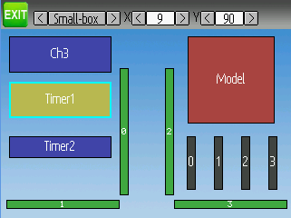
the configurable GUI part is more interesting. I think I'd start with a page to layout the elements where we have a 1:1 display with a menu on the header. The menu would allow me to select one of the element types (small-box, big-box, bar-graph, toggle, trim, joystick, but not icon since this is mandatory and must always be present) and then to place it. clicking on an existing item would let me move it or remove it.
I'm not sure we need a pulldown (though it would be cool if it works); a set of icons representing each of the element types may be sufficient.
I'd want to be able to see the x,y coordinate of the currently selected icon on the header as well. Having the ability to do some sort of alignment would be nice, but I'm not sure it is necessary.
I'd expect the display to indicate the elemment type and src, although that may not be possible for the toggle and bargraph elements since they are so small.
To configure the elements, I'm really not sure. I've thought about a couple solutions:
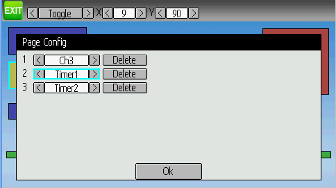
1) have a dialog popup from the positioning screen to edit the elements
2) have a separate screen to configure the elements
either way, I'd want to be able to see all of the elements of a given type at once (so I could configure all of the box elements at once, or all of the graph elements..much like the current deviation page). The Dialog box is probably too limited to support this feature today, though we might be able to embed a scrollable into it to solve that. Of course, the scrollable is not currently ported to the 320x240 screen so that might also need to be done (the scrollable is a widget I built for the 128x64 screen. It is a fully automated scroll window which can embed other widgets...something like a listbox but with widgets inside)
Please Log in or Create an account to join the conversation.
- Kdean
-
- Offline
- Posts: 213
This is an idea, dont know if it has been suggested already, but some time back someone asked about lables for items in the display. Well after playing with the "spacers" in cc895a i was thinking that instead of just inserting blank space, we can use these like text boxes. This way you can place lables above, below, or inbetween items. You can even display short notes about a model on screen with the big 120 sized box.
Is this a possibility?
Please Log in or Create an account to join the conversation.
- PhracturedBlue
-
- Offline
- Posts: 4403
having a new 'string' element type would be possible though with my current proposal.
Please Log in or Create an account to join the conversation.
- rbe2012
-
Topic Author
- Offline
- So much to do, so little time...
- Posts: 1433
We can design many other elements; e.g. a clock (I have the RTC code laying around somewhere...) or we can remove the limitation of the model's icon to 96x96 pixel (most of mine are no squares, more like 96x60), or even strings
Please Log in or Create an account to join the conversation.
- rbe2012
-
Topic Author
- Offline
- So much to do, so little time...
- Posts: 1433
Or for information which can change with some switch setting - something like "toggle strings".
Please Log in or Create an account to join the conversation.
- Kdean
-
- Offline
- Posts: 213
Please Log in or Create an account to join the conversation.
- PhracturedBlue
-
- Offline
- Posts: 4403
Here is the branch I made:
bitbucket.org/PhracturedBlue/deviation-newgui
What it can do:
you can layout widgets using x,y locations, from the ini file (the syntax may change)
What it can't do:
build devo10/7e
bargraphs are broken
no way to confgure the display except through the ini file
no conversion from the old models
limited number of elements
doesn't have wide-screen support
none of Rbe's new elemet types
I didn't remove the (now useless) page configuratiuon code
The main purpose was to define the main screen in a flexible way such that we can plug elements into the structure and have the display work properly.
Rbe, you should look at it to understand the pagecfg.h (specifically PageCfg2)
The code assumes all elements are 'packed'. I.e. we stop iterating over elements of a given type as soon as we find one that is undefined. An item is undefined when its y position is 0 (though that may change)
I will likely start porting your new elements over to it next. I want to design the interface on the devo8 and extend it up to the devo12 rather than the other way around, because it is usually easier to extend then to scale-down.
Please Log in or Create an account to join the conversation.
- rbe2012
-
Topic Author
- Offline
- So much to do, so little time...
- Posts: 1433
What is the issue in Devo10/7e - program code size or RAM usage? What about allocating the necessary memory at runtime? This could optimize both models (in yours you would not define the number of say toggle element but the MAXIMUM number of toggle elements and allocate only the amount needed for the config). This would need some care for cleaning up, but might be an efficient way to use RAM for costing bigger program code.
X- and Y-coordinates are some of the main parameters a gui object has. We only need a way to set them, to store and read them. This sounds very easy.
I have not yet (nor will I be able before tomorrow evening) taken a deeper look in your build. Maybe I will not be fast enough for you...
I have seen the structure you selected for the PageCfg2. From your previous posts I have expected a more universal approach where the objects are quite similar, varied only where necessary. If think it's a question of defining a fixed number but too much, possibly unused objects against having a more universal structure (with some general variables and e.g. a union of the diversifying variables), a little bit like the guiObject_t and the derived guiXxxx_t classes.
With a second look it's more reasonable. The memory needed for the elements is very small, and it will not make sense to take x and y out of the elements as general parameters. I haven't seen how it will be transferred to gui objects. Maybe it's time for a new object which can be any of the needed, distinguished by a special parameter (type)? Perhaps this is what you call a "widget"?
Please Log in or Create an account to join the conversation.
- PhracturedBlue
-
- Offline
- Posts: 4403
My initial analysis says that the latter will take up less RAM.
Switching the structure wouldn't be too hard to do though. I already wrote ~75% of the code.
For now, I'm going with it as is though.
I implemented a crude configuration page for the widget layout to see how well it works. Widgets are moved only via the spinboxes. It actually isn't that bad to do it this way if the drag-n-drop doesn't work out. I want to see if I can add a GUI_MoveWidget which won't result in redrawing the entire page as that would hep a lot.
Please Log in or Create an account to join the conversation.
- PhracturedBlue
-
- Offline
- Posts: 4403
I can now move all elements with the physical buttons. I am no longer convinced that drag-n-drop is really necessary given how the code is working now.
The thing that is still missing is the ability to configure the elements.
My current plan is to add a scrollable to the dialog widget and to populate it with all elements of the selected type when 'ENT' is pressed.
FYI, here's what it looks like at the moment:
Please Log in or Create an account to join the conversation.
- cropduster
-
- Offline
- Posts: 30
Thanks for your efforts, it is simply amazing what you guys all do in your free time. My respect.
Michael
Please Log in or Create an account to join the conversation.
- PhracturedBlue
-
- Offline
- Posts: 4403
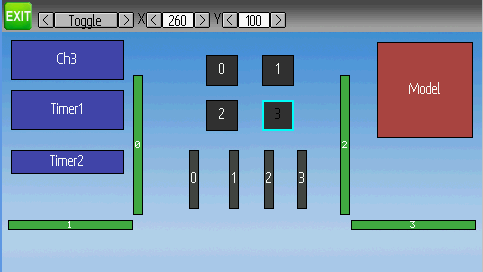
Devo12:
Devo12 with config dialog:
There are still a few issues, the biggest of which is that I don't have room for the page-change icons on the Devo8 page. I also want to spend time to see if I can improve the element-move performance.
I've placed the devo12 emulator here if anyone wants to try it:
bitbucket.org/PhracturedBlue/deviation-newgui/downloads
Rbe, please don't take offense that I went my own way. I was all set to merge your changes when I realized that a setup like this would likely make thing much more intuitive.
There is still more to do, and I would absolutely encourage you to keep up the good work to help improve Deviation.
Please Log in or Create an account to join the conversation.
- ave1
-
- Offline
- Posts: 162
Thank you both for all...
Okay to load and fly?
Please Log in or Create an account to join the conversation.
-
Home

-
Forum

-
Development

-
Builds

- Devo12 wide screen configurable GUI (intermediate


