- Posts: 1433
Devo12 wide screen configurable GUI (intermediate
- rbe2012
-
Topic Author
- Offline
- So much to do, so little time...
Please Log in or Create an account to join the conversation.
- Wene001
-
- Offline
- Posts: 277
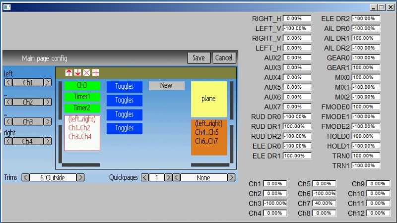
If you select an element, there are buttons (up+down) to create an invisible spaceholder above the selected element to move it up and down
Nach dem auswählen eines Elements auf der der Mainpage Config Seite, erscheinen zwei Tasten (up+down) die einen unsichtbaren größenveränderbaren "Spacer" oberhald des ausgewählten Elements einfügt.
Der Spacer darf sich nur solang vergrössern lassen, bis das Element am unteren Bildschirmrand angekommen ist, und wird am besten auf 0 zurückgesetzt wenn man durch draufklicken auf das nächste Element weiterschaltet, welches ja evtl grösser ist
Dadurch kann man sich die Buttons zum Top and Bottom Alignment sparen
Greetz Wene
Please Log in or Create an account to join the conversation.
- cropduster
-
- Offline
- Posts: 30
Wene001 wrote: This is also ready for the 12s "live"
I`m using it without issues
.....
Sorry for the stupid quetsion, but I install the 3.0.0 version first and then only the fs release from rbe?
Thanks,
Michael
Please Log in or Create an account to join the conversation.
- rbe2012
-
Topic Author
- Offline
- So much to do, so little time...
- Posts: 1433
I have no concrete idea yet how to realize it best.
Please Log in or Create an account to join the conversation.
- Wene001
-
- Offline
- Posts: 277
maybe its better not to remove the top and bottom alignment.
@cropduster
use the link in post #10478 in this thread to download firmware and filesystem
Please Log in or Create an account to join the conversation.
- cropduster
-
- Offline
- Posts: 30
Wene001 wrote: ....
@cropduster
use the link in post #10478 in this thread to download firmware and filesystem
I did that, upgraded FW devo12.dfu from the link and copied the filesystem, but what about the devo12-lib.dfu?? I did nothing so far, just like in the how-to video, I only did the two steps, firmware and filesystem, and I only get black screen and a heli icon on my devo 12s.
Did I do any wrong?
EDIT: I suppsoe I need to upgarde the library also, but the How-To Vidoe doe snot mention this. I foud the 3 steps in another post there to upgarde the library as 2nd step, just as for the original Walkera library.
Please Log in or Create an account to join the conversation.
- rbe2012
-
Topic Author
- Offline
- So much to do, so little time...
- Posts: 1433
EDIT: I think the sequence does not matter. The steps should be independent, it's only important to do all three steps.
EDIT2: I believe the video shows the procedure for devo8. For this tx there is no library to be installed separately.
Please Log in or Create an account to join the conversation.
- rbe2012
-
Topic Author
- Offline
- So much to do, so little time...
- Posts: 1433
The toggle issue is fixed, some pages (esp. tx config page) are redesigned for Devo12.
Please Log in or Create an account to join the conversation.
- Pattaya01
-
- Offline
- Posts: 181
Edit: Seems to be a general issue. If I delete an object, insert a new one, click on it 4 times, it disappears and you cannot insert another one anymore.
Please Log in or Create an account to join the conversation.
- rbe2012
-
Topic Author
- Offline
- So much to do, so little time...
- Posts: 1433
If you delete an element (or more) above, the "disappeared" element gets visible again and it gets obvious that it was too big to fit. There is something wrong with calculating the visibility of objects - non-fitting objects are not skipped.
I have worked on this yesterday because the spacers needed some rework. Maybe it was too late to see this bug... I confess I did most of the tests with the 2nd column where not trims are (in my default config).
Sometimes it is sufficient to change the trim type to make the elements visible (e.g. 2*big box, box, new element changed 2 or 3 times (crosses) --> invisible; appear when trims are removed).
Please Log in or Create an account to join the conversation.
- cropduster
-
- Offline
- Posts: 30
rbe2012 wrote: Yes, that is the way. devo12.dfu first, then change to library tab in dfuse-tool and install devo12-lib.dfu. The filesystem will be the last step.
EDIT: I think the sequence does not matter. The steps should be independent, it's only important to do all three steps.
EDIT2: I believe the video shows the procedure for devo8. For this tx there is no library to be installed separately.
Please Log in or Create an account to join the conversation.
- rbe2012
-
Topic Author
- Offline
- So much to do, so little time...
- Posts: 1433
Please Log in or Create an account to join the conversation.
- Wene001
-
- Offline
- Posts: 277
Damit meinte ich dass jedes Element bei den veränderbaren Eigenschaften einen up und einen Down Button dazukriegt, welcher den Abstand oberhald des ausgewählten Elements verändert.Wene001 wrote: Maybe its intuitive to implement it the following way:
If you select an element, there are buttons (up+down) to create an invisible spaceholder above the selected element to move it up and down
Nach dem auswählen eines Elements auf der der Mainpage Config Seite, erscheinen zwei Tasten (up+down) die einen unsichtbaren größenveränderbaren "Spacer" oberhald des ausgewählten Elements einfügt.
Der Spacer darf sich nur solang vergrössern lassen, bis das Element am unteren Bildschirmrand angekommen ist, und wird am besten auf 0 zurückgesetzt wenn man durch draufklicken auf das nächste Element weiterschaltet, welches ja evtl grösser ist
Greetz Wene
Ich find so wies jetzt ist ist nur unnötig kompliziert und nicht praxistauglich
Ich Möchte zB auf die Elementbox Toggles klicken und mit 2 Buttons denn Abstand oberhald des Toggle Elements verändern können, dann könnt ichs zB auch nur um 1 Pixel runterschieben.
Kein eigenes Spacer Element...
Please Log in or Create an account to join the conversation.
- rbe2012
-
Topic Author
- Offline
- So much to do, so little time...
- Posts: 1433
I also don't like these spacers. The idea of shifting every element individually up and down might be the best, but in consequence I will have to store the coordinates of every element. Actually I can calculate them.
It is the old question - memory size or calculating speed.
I fell the time to redraw the screen on the main config page is too long so speeding it up isn't the worst idea.
I think I will give this a try too.
Please Log in or Create an account to join the conversation.
- PhracturedBlue
-
- Offline
- Posts: 4403
Please Log in or Create an account to join the conversation.
- rbe2012
-
Topic Author
- Offline
- So much to do, so little time...
- Posts: 1433
the gui is quite far actually. I have it implemented in a way that it is possible to run on Devo12 in 4-column-mode (3 columns with a #define-switch) and on Devo8 in 3-column-mode. Nearly all changes I have done for enabling this are in the 320-240x16-directories (pages, gui) - none esp. in the 480x272-dirs (these files only include the 320x... files except the gui/480x272x16/_gui.h).
The gui itself seems to be stable as far as I can say and have heard. There is one wish of being able to move elements up and down what I want to implement next and I am struggling with controlling the config page with keys (what might be less important for a graphical interface).
I have reworked some pages to make use of the bigger screen (e.g. the tx config page or the timer page which don't need scroll bars on the 480-screen while they reproduce the 320-screen for Devo8...).
I believe I will need two more days for coding and testing (thanks to Steve I have now my Devo12 so I can make the first tests by myself). And I have to clean the code a little bit but this will be done fast.
I would greatly appreciate your opinion about the gui; if you think it is usable or if you have some other ideas which should be implemented.
Please Log in or Create an account to join the conversation.
- Wene001
-
- Offline
- Posts: 277
Please Log in or Create an account to join the conversation.
- rbe2012
-
Topic Author
- Offline
- So much to do, so little time...
- Posts: 1433
But this new value has to saved and loaded with the model... this is where I start.
Please Log in or Create an account to join the conversation.
- Pattaya01
-
- Offline
- Posts: 181
Please Log in or Create an account to join the conversation.
- Wene001
-
- Offline
- Posts: 277
No funny spacer elements and intuitive to use.
I would remove the top an bottom alignment to keep it simple.
Bigger steps on long press is all we need i think.
If possible dont redraw the whole screen
Can you change the limit of max 4 toggle elements to 6.
I like it like one complete element ist used each toggle.
switch on position 0 left icon
same switch on position 1 middle icon
same switch on position 2 right icon
This way the position of the icon gives the state of the switch for quicker reading.
BTW I don´t like that the color changes on a selected element.
I think the best way is to draw a red border around the selected element.
Thx again for the great work.
I´m only a stupid user
Please Log in or Create an account to join the conversation.
-
Home

-
Forum

-
Development

-
Builds

- Devo12 wide screen configurable GUI (intermediate


