- Posts: 649
- Forum
- News, Announcements and Feedback
- Feedback & Questions
- PB, request for code review and merge back
PB, request for code review and merge back
- sbstnp
-
- Offline
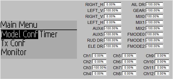
And main menu with 2 columns is a bit strange, I don't think there's a need for abbreviations there. one column should do it.
My apologies if this isn't the place to suggest this things though.
Devo 10 + 4in1
FrSky Taranis + TBS Crossfire
Please Log in or Create an account to join the conversation.
- suvsuv
-
Topic Author
- Offline
- Posts: 268
Answer #1: The only reason to select 15px height is to display Traditional Chinese clearly, which requires at least 15x15 size.sbstnp wrote: Just a thought, aren't the menu fonts a little too big? Main screen font size looks just right.
And main menu with 2 columns is a bit strange, I don't think there's a need for abbreviations there. one column should do it.
My apologies if this isn't the place to suggest this things though.
For all other language fonts, 12px height should be more than enough, corret me if I were wrong as I only check with English, Simplified Chinese and French.
Answer #2: One column should be OK, but I just want to provide shortcuts for some most-frequent-use menu items. Similar to what PB did for the devo8, I will provide a main-menu-page-config page to let user customize this page
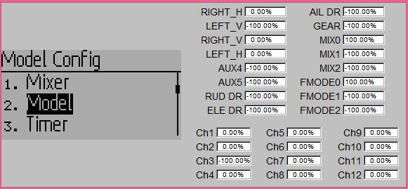
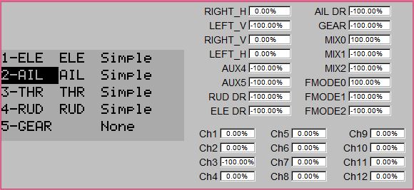
BTW, the main menu you saw is for the traditional mixer mode, new main menu for the deviation should show as below
Please Log in or Create an account to join the conversation.
- PhracturedBlue
-
- Offline
- Posts: 4403
Please Log in or Create an account to join the conversation.
- sbstnp
-
- Offline
- Posts: 649
suvsuv wrote: Answer #2: One column should be OK, but I just want to provide shortcuts for some most-frequent-use menu items. Similar to what PB did for the devo8, I will provide a main-menu-page-config page to let user customize this page
Most probably one column with proper words would be nicer. The menu is already shorter than on official firmware and probably no one really needs to quickly access this page very often. Maybe re-configuration would be and option, specify in an ini the items order?
Could fonts be switchable by language family? (I don't see why not, but how hard would it be?)
PS: I've built the sim and played a bit with it, but can't say how good it looks until I flash it on my 10.
Devo 10 + 4in1
FrSky Taranis + TBS Crossfire
Please Log in or Create an account to join the conversation.
- Forum
- News, Announcements and Feedback
- Feedback & Questions
- PB, request for code review and merge back
-
Home

-
Forum

-
News, Announcements and Feedback

-
Feedback & Questions

- PB, request for code review and merge back


