- Posts: 268
Vote request: Textsel widget for devo10
- suvsuv
-
Topic Author
- Offline
Please Log in or Create an account to join the conversation.
- rbe2012
-
- Offline
- So much to do, so little time...
- Posts: 1433
Please Log in or Create an account to join the conversation.
- suvsuv
-
Topic Author
- Offline
- Posts: 268
Please Log in or Create an account to join the conversation.
- FDR
-
- Offline
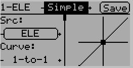
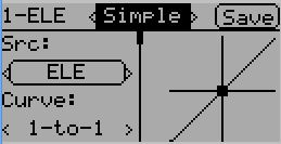
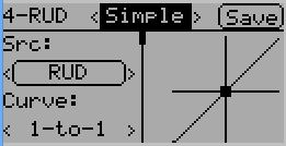
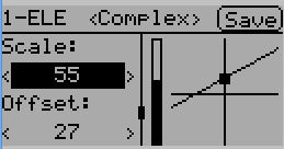
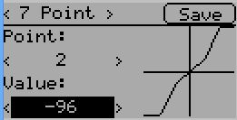
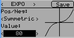
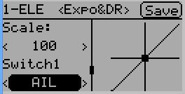
I think those fonts (and the fields, menu items and all that depends on the fonts) are still too large for such a display.
I know, that they cannot be much smaller to support the traditional chinese, but then if they have to be that large, you should optimize the display and the widgets to spare more room.
For example showing boxed text is a bit of luxury. You will invert the selected widget anyway, so it will be boxed, but that inverted area only have to be one pixel wider on each side, while a simple box needs at least two pixels space for each side.
But if there are no boxes, how you can sign, that it is a value or a button, you could ask...
Well, for the values there are the < > signs, like the curve funtion value on your screen.
The buttons are harder, but I think a square bracket would do: [ Save ]
It might not be so fancy, but you would have more space for other controls, and it would need even less drawing, as they could be displayed as text...
Please Log in or Create an account to join the conversation.
- suvsuv
-
Topic Author
- Offline
- Posts: 268
And I don't believe squeeze letter smaller to hold more items is a good idea, it just make the GUI look strange.
Please Log in or Create an account to join the conversation.
- FDR
-
- Offline
Please Log in or Create an account to join the conversation.
- PhracturedBlue
-
- Offline
- Posts: 4403
There may be screens where we can use 8-px fonts (for instance where the screen is mostly filled with numerical data), but generally we need to be able to handle the 'full' unicode character set wherever we do today with the Devo8 (and in a few places we don't yet)
I like your 2nd round spinbox with the slight space around the '<', and '>'. and while I agree it would be nicer to get more info on the screen, I don't really see any way to do that right now, and your solution of using a scrollbar is a good one.
Please Log in or Create an account to join the conversation.
- suvsuv
-
Topic Author
- Offline
- Posts: 268
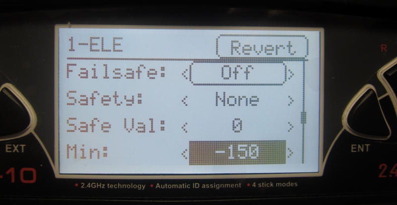
BTW, I do believe the current GUI is better than Walkera's , if you compared the screenshot with real device's picture
In terms of the Er9X, its LCD has more dot-pixel than devo's, and there is no way for it to support Chinese or other complex languages with its current font selection
Please Log in or Create an account to join the conversation.
- FDR
-
- Offline
That's really nice, I just worry about displaying some more complex forms, like the complex mixer itself.
For the list like forms (like this picture), it is perfect.
The problem with the complex mixer is that it contains more pages, so you have to page throw them, when you are searching for a setting.
However if you don't see all the settings of a page at once, then you have to scroll down too on all pages...
I must admit, that I do not know any better solution!
BTW, about your sample:
Would it be possible to move the revert button a pixel higher, and all the contents under the line a pixel lower, to not contact the separating line?
There is room for that, and it would be nicer...
Please Log in or Create an account to join the conversation.
- suvsuv
-
Topic Author
- Offline
- Posts: 268
The current font I am using is 7x5, which is not the right one I will use for release version. I actually need a 12x12(actual size is 11 x11 with at least 1 row and 1 column spacing) font to support multi-national languages. Currently, this size of font is not there yet. When using 12x12 font, there should be no room any more.FDR wrote: OK, I'm sold.
BTW, about your sample:
Would it be possible to move the revert button a pixel higher, and all the contents under the line a pixel lower, to not contact the separating line?
There is room for that, and it would be nicer...
In terms of complex mixer pages, they are all done in devo10 already. Of coz, as you mentioned above, we can't expect that these pages can be drawn as nice as they are in devo8, due to pixel limitation. However, they are still better than the factory's Curve GUI.
Please Log in or Create an account to join the conversation.
-
Home

-
Forum

-
News, Announcements and Feedback

-
Feedback & Questions

- Vote request: Textsel widget for devo10

