
DEVO10 UI
- FDR
-
Topic Author
- Offline
First of all it needs a proper font more than anything else. I know it has low priority, but the whole thing looks incomplete this way, even thought the functionality is good.
I think there are pages, where you don't necessarily have to copy the DEVO 8.
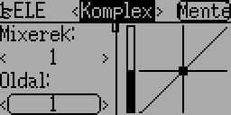
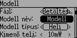
For example the trim list page is crowded while it is already one column less, and translated labels won't fit. I think it could be a simple button list with a short label describing which trim is that about: left vertical (LV), left horizontal, etc. I think it is very rarely changed if ever...
The Expo&DR page could be arranged like the Timers are. There the two timer is on two separate scrolled pages whether they take all the place or not. In this way the DR page could be split to three parts with one (optional) graph per page, but since it has more options to set, it should have two pages per graph. The only thing is that those pages should have some label indicating which part of the whole you actually see.
An other general remark is that the save buttons are too small, translated labels do not fit, and the owerflowing part of the text is draw on the left side of the screen...
...to be continued.
- suvsuv
-
- Offline
- Posts: 268
I think there are pages, where you don't necessarily have to copy the DEVO 8.
For example the trim list page is crowded while it is already one column less, and translated labels won't fit. I think it could be a simple button list with a short label describing which trim is that about: left vertical (LV), left horizontal, etc. I think it is very rarely changed if ever...
I am doing as you suggest: I was on purpose to show only 3 items per row, it is very rare that the trim- is not align with trim+ and I put detail in its sub-page. I believe squeezing all the 4 items in a page just as you said : copy the DEVO 8
The Expo&DR page could be arranged like the Timers are. There the two timer is on two separate scrolled pages whether they take all the place or not. In this way the DR page could be split to three parts with one (optional) graph per page, but since it has more options to set, it should have two pages per graph. The only thing is that those pages should have some label indicating which part of the whole you actually see.
Might take time to improve the Expo&DR page later on
An other general remark is that the save buttons are too small, translated labels do not fit, and the owerflowing part of the text is draw on the left side of the screen...
Again, making the save button wider occupies other widgets' position, you will still found that translated labels do not fit others .
If the translated labels don't fit ,the only solution is using abbreviation
- FDR
-
- Offline
Yep, but what I was suggesting to drop the other two columns too, and keep only the buttons to open the detailed page...suvsuv wrote:
I am doing as you suggest: I was on purpose to show only 3 items per row, it is very rare that the trim- is not align with trim+ and I put detail in its sub-page. I believe squeezing all the 4 items in a page just as you said : copy the DEVO 8I think there are pages, where you don't necessarily have to copy the DEVO 8.
For example the trim list page is crowded while it is already one column less, and translated labels won't fit. I think it could be a simple button list with a short label describing which trim is that about: left vertical (LV), left horizontal, etc. I think it is very rarely changed if ever...
Again, making the save button wider occupies other widgets' position, you will still found that translated labels do not fit others .An other general remark is that the save buttons are too small, translated labels do not fit, and the owerflowing part of the text is draw on the left side of the screen...
If the translated labels don't fit ,the only solution is using abbreviation
This is the most crowded header, and there is still enough place to make the save button larger:
BTW, didn't you want to change them to be live but revertable instead the need to save?
- PhracturedBlue
-
- Offline
- Posts: 4403
What do you mean?First of all it needs a proper font more than anything else. I know it has low priority, but the whole thing looks incomplete this way, even thought the functionality is good.
The Devo10 font is as complete as the Devo8 font. I assume you are building out of my Repo and not suvsuv's? i don't think he took my most recent font work.
- FDR
-
- Offline
BTW, I've sent a ticket about the DEVO 8 font too, that it misses at least one character...
I see different fonts on different pages.
This serif one has no "ű" (0x0171), and some letters has different baseline:
This wider sans-serif one has no "é" (0x00E9):
- FDR
-
- Offline
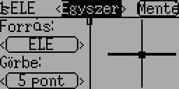
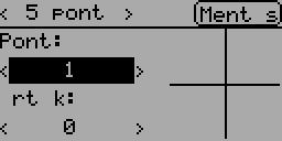
Like on my previous pictures, it uses different fonts for the mixer page and for the curve editor.
In the mixer's font there are no "ű" and the "á" base is misaligned (look at the first "Forrás:" label).
In the font of the curve editor there is no "é" nor "É", so there are spaces instead in the "Mentés" (=Save) and "Érték:" (=Value:)
- FDR
-
- Offline
- PhracturedBlue
-
- Offline
- Posts: 4403
- FDR
-
- Offline
PhracturedBlue wrote:
No...only for the limits page. doing it for the channel page could be very dangerous.FDR wrote: BTW, didn't you want to change them to be live but revertable instead the need to save?
OK, I missed that, but aggree...
- FDR
-
- Offline
The labels of the monitor page miss the _tr() function again...
The font itself is still a little bit weird.
There are mixed serif and sans-serif style letters, some are condensed a lot while others are too wide.
In english it is not that bad, but the extended letters of other languages differ from the letters they are based on
For example "a" vs "á":
"e" vs "é", "o" vs "ö" or "ő":
I didn't tried the other languages, but I guess there might be similar problems too.
I know it's low priority, and making a new consistent font is a lot of graphic work, but it could save some space too...
- PhracturedBlue
-
- Offline
- Posts: 4403
So the current font for the devo10 is built by taking:
Firefly-11px for 0x20 - 0xff
Ubuntu-C-11px for 0x100 - 0x4DFF (there are a lot of missing chars in that range)
Firefly-12px for 0x4E00-0x045F
This explains the different fonts mixing for Euro-languages
For the Devo8, we just do:
Ubuntu-C-15px for 0x20-0x045F
Firefly-15px for 0x4E00-0xFFFF
So it is consistent (everything above 0x4E00 is CJK)
We are now using 'standard' font files, so fonts can be worked on with Fontforge, and we have automation to extract/rasterize from ttf/ttc files.
So, if there is a bitmapped font at 11px that includes characters 0-0x045F (or at least through 0x200) that is free to use and distribute, it is not difficult to swap out. But finidngone that is narrow-enough to fitin the space we have is challenging and I haven't yet succeeded.
- PhracturedBlue
-
- Offline
- Posts: 4403
- FDR
-
- Offline
- suvsuv
-
- Offline
- Posts: 268
In the stick-input subpage, all labels are used INPUT_SourceName() which will got translated properly.FDR wrote: @suvsuv:
The labels of the monitor page miss the _tr function, so they are not translated...
In the channel output, all labels are numbers , and I don't want them to be translated. All people in the world should be able to read Arabic numbers.
- FDR
-
- Offline
suvsuv wrote:
In the stick-input subpage, all labels are used INPUT_SourceName() which will got translated properly.FDR wrote: @suvsuv:
The labels of the monitor page miss the _tr function, so they are not translated...
In the channel output, all labels are numbers , and I don't want them to be translated. All people in the world should be able to read Arabic numbers.
Sorry, I'm talking about the header: "Channel output" and "Stick input"...
EDIT: Sorry again, they contain _tr, just the labels have been changed...
- PhracturedBlue
-
- Offline
- Posts: 4403
- PhracturedBlue
-
- Offline
- Posts: 4403
it is based on firefly (the current font in the repo), but I have hand-drawn all of the extended latin and cyrillic characters. This should give a nice consistent font which is narrower and taller than dogfont. I may need to tweak it further (I'm not sure all characters have even space between them for instance).
- FDR
-
- Offline
Which repo to test, and where to report the bugs I found?
Until the answer, here is a bug of both repos:
On the inputs part of the monitor page the down scrolling is not limited, so you can scroll out all the contents, and at the 19th step down it crashes.
- PhracturedBlue
-
- Offline
- Posts: 4403
Did you test the above font (the firefly one, not the dogfont one)? I want to release it, but I'd like some confirmation that it looks ok
-
Home

-
Forum
-
Development
-
Development
- DEVO10 UI