
- Posts: 649
Devo 10/7E small UI (updated 1st post)
- sbstnp
-
Topic Author
- Offline
Less
More
13 Dec 2013 12:36 - 02 Feb 2014 19:48 #16575
by sbstnp
Devo 10 + 4in1
Spektrum Dx9
FrSky Taranis + TBS Crossfire
Devo 10/7E small UI (updated 1st post) was created by sbstnp
Current status:
- tested by me and some others.
- in the nightlies.
Please visit this thread for configuration reference:
www.deviationtx.com/forum/custom-skins/2...devo-7e-10-reference
All the code can be found here:
bitbucket.org/sbstnp/dev-flex-ui
config.inis are in the repo named:
config-small.ini
config-large.ini
updated above
This post has a zip with 2 config.ini files, one is default big 12normal font, the other is small UI with 04b03 font.
Original post below:
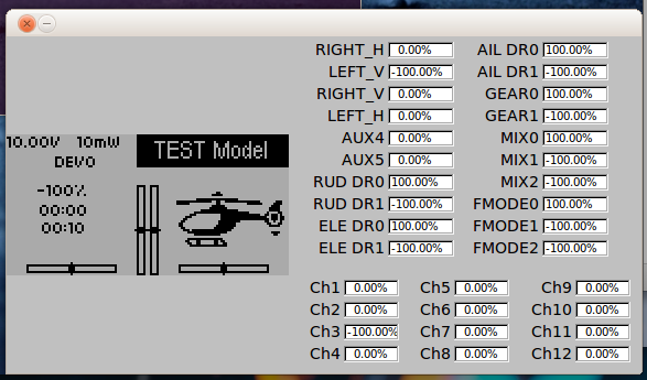
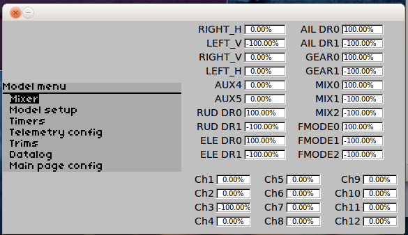
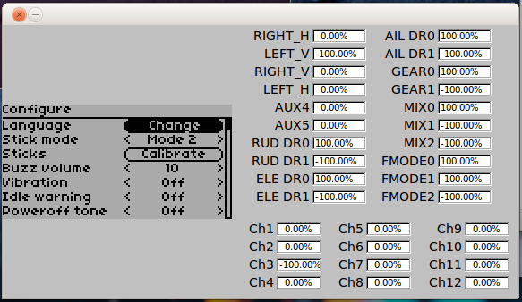
Just something I've been working on for a while. This is the second go at it my 1st was lost in a HDD crash and put on hold for about 6 months.
I have it mostly working but I'm still hunting pixel level inaccuracies and it's going slowly since I can only work on it late at night when I'm usually very tired.
Devo 10 + 4in1
FrSky Taranis + TBS Crossfire
Last edit: 02 Feb 2014 19:48 by sbstnp.
- PhracturedBlue
-
- Offline
Less
More
- Posts: 4403
13 Dec 2013 14:03 #16577
by PhracturedBlue
Replied by PhracturedBlue on topic WIP / Devo 10 (eventually 7e) condensed GUI.
It does look very nice. Is there anything here you can't do with just a theme? You didn't show anything in these screens that i see that couldn't be done by redefining the main-page layout and getting a good small font. Maybe alignment issues I guess. And the number of items per page may be hard-coded. I'd love to have enough flexibility that someone could get this with just a theme though.
If you check in your code and push it to bitbucket often, you won't lose it like that")
If you check in your code and push it to bitbucket often, you won't lose it like that
- sbstnp
-
- Offline
Less
More
- Posts: 649
13 Dec 2013 16:17 #16580
by sbstnp
Devo 10 + 4in1
Spektrum Dx9
FrSky Taranis + TBS Crossfire
Replied by sbstnp on topic WIP / Devo 10 (eventually 7e) condensed GUI.
Indeed, number of items is hard coded and there is a plethora of small pixel misalignments when sizing down most GUI elements and re-writing some parts of different pages to account for the increased number of elements.
I intend to go the whole mile and then if it looks all right maybe we can make it an option for latin alphabets. I haven't checked accented chars yet so I'm not sure they will work with that particular font, but modding the font should be the easy part. English looks perfect so far, so for it's worth the effort.
I intend to go the whole mile and then if it looks all right maybe we can make it an option for latin alphabets. I haven't checked accented chars yet so I'm not sure they will work with that particular font, but modding the font should be the easy part. English looks perfect so far, so for it's worth the effort.
Devo 10 + 4in1
FrSky Taranis + TBS Crossfire
- rbe2012
-
- Offline
- So much to do, so little time...
Less
More
- Posts: 1433
13 Dec 2013 16:59 #16581
by rbe2012
Replied by rbe2012 on topic WIP / Devo 10 (eventually 7e) condensed GUI.
It is great - much more usable than only four lines.
sbstnp, do you use a smaller font or do you recalculate an existing font? With the first we could try to calculate how much lines are possible on the screen and adopt scroll areas and line spacing. I have done similar (for only a few pages) when I optimized them for the 480x272-screen.
sbstnp, do you use a smaller font or do you recalculate an existing font? With the first we could try to calculate how much lines are possible on the screen and adopt scroll areas and line spacing. I have done similar (for only a few pages) when I optimized them for the 480x272-screen.
- sbstnp
-
- Offline
Less
More
- Posts: 649
13 Dec 2013 20:17 #16589
by sbstnp
Devo 10 + 4in1
Spektrum Dx9
FrSky Taranis + TBS Crossfire
Replied by sbstnp on topic WIP / Devo 10 (eventually 7e) condensed GUI.
It's the font called 04b03 already present in the filesystem (I think PB introduced it?). I have another one, somewhote similar but I'm not sure of the licensing yet.
Anyway, since this UI will be limited to latin languages creating and tuning a font isn't a big deal, I've done it before.
The current UI is partly aware of how many lines are fitting at the same time (e.g. menus) but there are a lot of places needing rewriting. I also had to affect some UI elements like labels and buttons in order to better center text on different states (selected, unselected).
I'll keep at it
rbe2012 wrote: It is great - much more usable than only four lines.
sbstnp, do you use a smaller font or do you recalculate an existing font? With the first we could try to calculate how much lines are possible on the screen and adopt scroll areas and line spacing. I have done similar (for only a few pages) when I optimized them for the 480x272-screen.
Devo 10 + 4in1
FrSky Taranis + TBS Crossfire
- sbstnp
-
- Offline
Less
More
- Posts: 649
13 Dec 2013 20:22 #16591
by sbstnp
Bad luck is bad luck, happened while on a business trip with no internet access (actually very expensive internet access). Now I carry an external backup drive with me
Devo 10 + 4in1
Spektrum Dx9
FrSky Taranis + TBS Crossfire
Replied by sbstnp on topic WIP / Devo 10 (eventually 7e) condensed GUI.
PhracturedBlue wrote: If you check in your code and push it to bitbucket often, you won't lose it like that
Bad luck is bad luck, happened while on a business trip with no internet access (actually very expensive internet access). Now I carry an external backup drive with me
Devo 10 + 4in1
FrSky Taranis + TBS Crossfire
- WheresWaldo
-
- Offline
Less
More
- Posts: 253
13 Dec 2013 21:13 #16598
by WheresWaldo
Replied by WheresWaldo on topic WIP / Devo 10 (eventually 7e) condensed GUI.
If this makes it into the new release, and I hope it does, I will need to redo all the screenshots. I can use the current ones as placeholders. Want to make sure the documentation is as current as possible.
I tried changing all the fonts in config.ini to 04b03 and that did not accomplish the desired results so I am glad someone is looking at the code to make this a reality.
I tried changing all the fonts in config.ini to 04b03 and that did not accomplish the desired results so I am glad someone is looking at the code to make this a reality.
- PhracturedBlue
-
- Offline
Less
More
- Posts: 4403
13 Dec 2013 22:15 #16601
by PhracturedBlue
Replied by PhracturedBlue on topic WIP / Devo 10 (eventually 7e) condensed GUI.
It is very unlikely this will make it into the upcoming release, and if it does, it would likely be only as a theme and not the default. Supporting different layouts for different languages would be a lot of work, and I'm unlikely to add native support for it.
So the documentation will likely not need an update now or in the future for this.
So the documentation will likely not need an update now or in the future for this.
- sbstnp
-
- Offline
Less
More
- Posts: 649
14 Dec 2013 05:16 #16609
by sbstnp
Devo 10 + 4in1
Spektrum Dx9
FrSky Taranis + TBS Crossfire
Replied by sbstnp on topic WIP / Devo 10 (eventually 7e) condensed GUI.
Aa PB just said this won't make into a release very soon. I intend to have sources and dev builds publicly available before year's end though, so everyone can play with the emulator at least (high chances of reboots on the TX itself if I screw something up, which is almost a certainty at this stage).
My first goal is to have all the UI supporting 8 lines and be revertable to 5 lines with no ill effects. This could be toggled by a setting in config.ini.
Second goal is to have custom fonts and user controllable sizes. This will be both harder and more dangerous and I haven't given this too much thought yet.
Devo 10 + 4in1
FrSky Taranis + TBS Crossfire
- WheresWaldo
-
- Offline
Less
More
- Posts: 253
15 Dec 2013 15:06 - 15 Dec 2013 15:08 #16663
by WheresWaldo
Replied by WheresWaldo on topic WIP / Devo 10 (eventually 7e) condensed GUI.
sbstnp,
I would be very interested in helping you test this. I have already been jealous of the Devo8/12 owners with all that info on their screens. I even duplicated some of the more information specific screens.
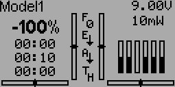
I could just imagine what I might be able to display with more lines available. and smaller toggles too! Notice that I am not using a model.icon, If I can't tell what kind of aircraft I am flying without looking at it directly I have more problems than just my setup and display screen.
I would be very interested in helping you test this. I have already been jealous of the Devo8/12 owners with all that info on their screens. I even duplicated some of the more information specific screens.
I could just imagine what I might be able to display with more lines available. and smaller toggles too! Notice that I am not using a model.icon, If I can't tell what kind of aircraft I am flying without looking at it directly I have more problems than just my setup and display screen.
Last edit: 15 Dec 2013 15:08 by WheresWaldo.
- sbstnp
-
- Offline
Less
More
- Posts: 649
15 Dec 2013 20:04 #16679
by sbstnp
Devo 10 + 4in1
Spektrum Dx9
FrSky Taranis + TBS Crossfire
Replied by sbstnp on topic WIP / Devo 10 (eventually 7e) condensed GUI.
As soon as I have a good enough code base I'll publish both source and a build. Stay tuned, any help is welcomed! Another week till vacation
Devo 10 + 4in1
FrSky Taranis + TBS Crossfire
- sbstnp
-
- Offline
Less
More
- Posts: 649
27 Dec 2013 12:56 - 27 Dec 2013 12:58 #17089
by sbstnp
Devo 10 + 4in1
Spektrum Dx9
FrSky Taranis + TBS Crossfire
Replied by sbstnp on topic WIP / Devo 10 (eventually 7e) condensed GUI.
Ok so I got a little time to work on this some more.
I started with a new fork and pushed most of the changes here:
bitbucket.org/sbstnp/deviation-bw-small-ui
I'm still experimenting with ways of tweaking the UI widgets and keep the existing code as much as possible so far. Unfortunately there are many many assumptions about font sizes and how things are placed on the screen and spacing.
Some more pix, buttons are now underlines when not selected (not definitive but looks cleaner) and I changed some labels (won't happen if I'm to keep compatibility with 12 pixel fonts, but it looks nice):
Devo 10 + 4in1
FrSky Taranis + TBS Crossfire
Last edit: 27 Dec 2013 12:58 by sbstnp.
- WheresWaldo
-
- Offline
Less
More
- Posts: 253
27 Dec 2013 15:23 - 27 Dec 2013 15:26 #17101
by WheresWaldo
Replied by WheresWaldo on topic WIP / Devo 10 (eventually 7e) condensed GUI.
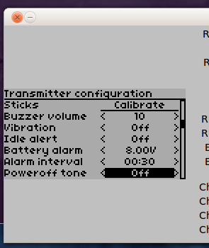
Love it. Would be good on the Devo10 too. My I make a suggestion about the buttons (just not feeling the underline). Is there a significant visual difference between <> and (), if so perhaps the buttons could beas in the image above rather than Calibrate
( Calibrate )
Last edit: 27 Dec 2013 15:26 by WheresWaldo.
- sbstnp
-
- Offline
Less
More
- Posts: 649
27 Dec 2013 15:34 - 27 Dec 2013 15:40 #17103
by sbstnp
Devo 10 + 4in1
Spektrum Dx9
FrSky Taranis + TBS Crossfire
Replied by sbstnp on topic WIP / Devo 10 (eventually 7e) condensed GUI.
Big problem when the button will be inside <>, it wiil look kinda weird, like <( Load..)>. Actually weider on a small font. Will put pix up in 5.
Edit: pic.
Not liking this. But I have another idea, stay tuned.
Edit: pic.
Not liking this. But I have another idea, stay tuned.
Devo 10 + 4in1
FrSky Taranis + TBS Crossfire
Last edit: 27 Dec 2013 15:40 by sbstnp.
- HappyHarry
-
- Offline
Less
More
- Posts: 1136
27 Dec 2013 16:37 #17112
by HappyHarry
Replied by HappyHarry on topic WIP / Devo 10 (eventually 7e) condensed GUI.
this is looking good, though is there any reason to have the parts that cant be scrolled through left and right inside brackets at all? so have those that can be scrolled through inside < > and those that cant not inside brackets at all?
- FDR
-
- Offline
27 Dec 2013 16:55 #17114
by FDR
Replied by FDR on topic WIP / Devo 10 (eventually 7e) condensed GUI.
What about sqare brackets?
[button]
<[spinbutton]>
[button]
<[spinbutton]>
- WheresWaldo
-
- Offline
Less
More
- Posts: 253
27 Dec 2013 16:59 - 27 Dec 2013 17:01 #17115
by WheresWaldo
Replied by WheresWaldo on topic WIP / Devo 10 (eventually 7e) condensed GUI.
It sounded good in my head, but seeing the <(Button)> combination doesn't appeal to me either.
One thing I saw above and really like was the TX Battery and TX Power on the same line at the top. Can it be placed in any position with your mods? I never liked that the Power was below the battery on the Deviation screen and you cannot move it.
Secondly, are you also minimizing the toggles, I tried it on the standard file system. I redid the togglex.bmp smaller but had to keep the original .bmp size. While I could get smaller ones to display, the space allotted them on screen was still too big and you cannot overlap them without display issues appearing.
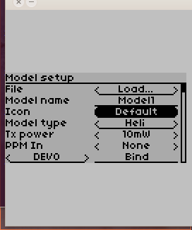
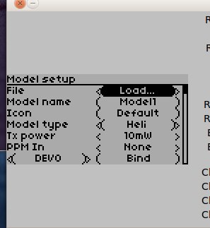
Third, was DEVO the test model name or is it displaying the Protocol?
One thing I saw above and really like was the TX Battery and TX Power on the same line at the top. Can it be placed in any position with your mods? I never liked that the Power was below the battery on the Deviation screen and you cannot move it.
Secondly, are you also minimizing the toggles, I tried it on the standard file system. I redid the togglex.bmp smaller but had to keep the original .bmp size. While I could get smaller ones to display, the space allotted them on screen was still too big and you cannot overlap them without display issues appearing.
Third, was DEVO the test model name or is it displaying the Protocol?
Last edit: 27 Dec 2013 17:01 by WheresWaldo.
- PhracturedBlue
-
- Offline
Less
More
- Posts: 4403
27 Dec 2013 17:01 #17117
by PhracturedBlue
Replied by PhracturedBlue on topic WIP / Devo 10 (eventually 7e) condensed GUI.
or you could try a double-arrow:
spin-button:
<Item>
spin-press button:
<<Item>>
spin-button:
<Item>
spin-press button:
<<Item>>
- FDR
-
- Offline
27 Dec 2013 17:23 #17121
by FDR
Replied by FDR on topic WIP / Devo 10 (eventually 7e) condensed GUI.
That's not a good idea, because then the simple buton would be <item>, which is the same as the nonpressable spinbox...
- PhracturedBlue
-
- Offline
Less
More
- Posts: 4403
27 Dec 2013 17:58 #17126
by PhracturedBlue
I've implemented the ability to move (or remove) the TxPower and Battery indicators on the main page. This is 128x64 only for now, and it looks kinda ugly on the layout page due to interfering with the 'Move' label. I'm not sure what to do about that yet.
Replied by PhracturedBlue on topic WIP / Devo 10 (eventually 7e) condensed GUI.
I wouldn't change the regular button. Leave it as '()'. I'm saying you may have to throw away the current concept that a spin-press box is just a concatenation of spin and press boxes.FDR wrote: That's not a good idea, because then the simple buton would be <item>, which is the same as the nonpressable spinbox...
You know, all you need to do is askWheresWaldo wrote: One thing I saw above and really like was the TX Battery and TX Power on the same line at the top. Can it be placed in any position with your mods? I never liked that the Power was below the battery on the Deviation screen and you cannot move it.
I've implemented the ability to move (or remove) the TxPower and Battery indicators on the main page. This is 128x64 only for now, and it looks kinda ugly on the layout page due to interfering with the 'Move' label. I'm not sure what to do about that yet.
Time to create page: 0.709 seconds
-
Home

-
Forum
-
Development
-
Development
- Devo 10/7E small UI (updated 1st post)