- Posts: 1971
Test of the new menu system
- hexfet
-
- Offline
#define NORMALBOXNEG_FONT (Display.font[17])That's the font being set to display the boxes, but not sure where to go from there.
edit: seems like the issue was introduced with 8bdf866, so above may be unrelated
Please Log in or Create an account to join the conversation.
- PhracturedBlue
-
- Offline
- Posts: 4403
Please Log in or Create an account to join the conversation.
- PhracturedBlue
-
- Offline
- Posts: 4403
Please Log in or Create an account to join the conversation.
- FDR
-
Topic Author
- Offline
Well, that's not listbox-like at all, and I don't really like it.PhracturedBlue wrote:
Yes, this is what I decided on. the selection will stay with what you had unless it no longer is on the screen. the original selection is lost as soon as it scrolls off screen. So it is not a bug. if you don't like it we can discuss alternatives.FDR wrote: Yes, the bug is still there:
Go into the model select list. Probably the first model is selected.
Start to scroll down.
As the first row disappears upwards, the selection changes to model2, model3, etc.
If you scroll back, the selection remains on the one which was on the top of the list.
All the model selection, icon selection, model save as, and probably the template selection does that in both directions. (I haven't got enough templates to check...)
I see that you can leave the page with exit without actually approving the selection, but it's still frightening...
Please Log in or Create an account to join the conversation.
- PhracturedBlue
-
- Offline
- Posts: 4403
Please Log in or Create an account to join the conversation.
- hexfet
-
- Offline
- Posts: 1971
It's fixed on the telemtest page, but not on the main page. I selected FrskyX, then bind, then put RSSI in box2 and set a limit of 100 in telemetry config. On the main page the value disappears when the limit is exceeded.PhracturedBlue wrote: Thanks, should be fixed now in bothe master and 5.0 branch
Please Log in or Create an account to join the conversation.
- FDR
-
Topic Author
- Offline
You are right, it was this way forever indeed.PhracturedBlue wrote: I don't see why 'frightening' is the right word. It shuld behave exactly the same way it always has. even in 4.01 if you scrolled the listbox, the selection would move to stay at the top. as you scrolled back, it would move to the bottom and then move up one at a time. This should not be any different.
This shows how few models I have and how rearly I fly, so I didn't realized so far...
I used the term frightening, because IMO in general a scrolling shouldn't change anything, so it would be frightening for someone who doesn't aware such change can happen. But you know my english is not that polished anyway...
Please Log in or Create an account to join the conversation.
- PhracturedBlue
-
- Offline
- Posts: 4403
should be fixed there now toohexfet wrote:
It's fixed on the telemtest page, but not on the main page. I selected FrskyX, then bind, then put RSSI in box2 and set a limit of 100 in telemetry config. On the main page the value disappears when the limit is exceeded.PhracturedBlue wrote: Thanks, should be fixed now in bothe master and 5.0 branch
Please Log in or Create an account to join the conversation.
- PhracturedBlue
-
- Offline
- Posts: 4403
The Devo10 uses long-press up/down. This is an option for the devo8 as well, though it is less convenient to use. The downside is that on the AT9, you cannot use long/press on the arrow keys. I could remap the controls on the at9 such that (currently unused) mode button would let you cycle through quick-pages (but only in one directiion). This would probably be ok, except that it would break the ability to use the main-layout page as a quick-page (since I already have plans for the mode button there). Even still, this is probably my preferred solution.
I could also keep the left/right quickpage buttons on the devo8, and start with no selection when in quickpage mode (for instance until up/down is pressed), but this adds a lot of complication to saving/restoring the selection during menu mode, so I don't love that option either.
Please Log in or Create an account to join the conversation.
- Fernandez
-
- Offline
- Posts: 983
Any tx has sticks, also it would be very intuitive, fast to use, also it might save some buttons?
Please Log in or Create an account to join the conversation.
- FDR
-
Topic Author
- Offline
www.deviationtx.com/forum/3-feedback-que...nobs-to-select#43353
Please Log in or Create an account to join the conversation.
- PhracturedBlue
-
- Offline
- Posts: 4403
Please Log in or Create an account to join the conversation.
- hexfet
-
- Offline
- Posts: 1971
The main page telemetry value display inversion now works correctly for 128x64.
Please Log in or Create an account to join the conversation.
- phantom8
-
- Offline
- Posts: 109
Please Log in or Create an account to join the conversation.
- PhracturedBlue
-
- Offline
- Posts: 4403
As of version c07562 (current nightly) fast scrolling is supported in all menus. I am not 100% confident that there are no side effects, so please let me know if you see any.phantom8 wrote: I've tested on both 7e & 10 emulators. Before menu changes, you can hold UP/DOWN arrow buttons to auto-repeat scrolling on Model selection box. Now, auto-repeat doesn't work by holding down arrow buttons. If you've 30 models, you'll need to press the Down button 30 times to go from top to bottom. It's really tedious. BTW, the same thing happens on a real 7e.
Please Log in or Create an account to join the conversation.
- phantom8
-
- Offline
- Posts: 109
PhracturedBlue wrote:
As of version c07562 (current nightly) fast scrolling is supported in all menus. I am not 100% confident that there are no side effects, so please let me know if you see any.phantom8 wrote: I've tested on both 7e & 10 emulators. Before menu changes, you can hold UP/DOWN arrow buttons to auto-repeat scrolling on Model selection box. Now, auto-repeat doesn't work by holding down arrow buttons. If you've 30 models, you'll need to press the Down button 30 times to go from top to bottom. It's really tedious. BTW, the same thing happens on a real 7e.
Thanks for the fix! Just retested it and the fast scrolling is working fine.
Please Log in or Create an account to join the conversation.
- Thomas.Heiss
-
- Offline
- Posts: 698
The jump #1 (over the top) to #30 is not working 5.0.0 for model list.
In other menus like mixer, model setup jumping over the top / from bottom to top (back) by just using the UP button works.
Is the hard stop at model list #1 intended or have you changed that yet in latest code PhracturedBlue?
Thomas
Please Log in or Create an account to join the conversation.
- FDR
-
Topic Author
- Offline
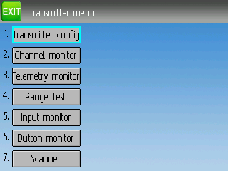
This is how it looks now:
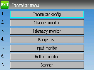
It is much better if I enlarge and center the button:
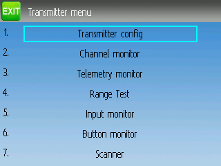
But I think we should get rid of the button face all together:
It is the same button, just the bitmap of it is fully transparent.
I would be happy if I could left align the text, like it is on the B&W screens, but the button widget doesn't allow that.
What do you think, which looks better?
Please Log in or Create an account to join the conversation.
- Moeder
-
- Offline
- Posts: 796
Please Log in or Create an account to join the conversation.
- Deal57
-
- Offline
- Posts: 857
For me i don't really focus on the look/feel of the color menus now that they can be (mostly) used with the buttons like the mono menus. But when I use the stylus or my fat fingers, I find the larger targets (buttons) work better for me.
Deviation Devo7e 3way switch mod, A7105, NRF24L01
Devo6s 2x2 switch mod, trim mod, haptic, multimodule, A7105, NRF24L01, CC2500
Devo12e 4-in-1 with voice mod -- it speaks!!
Please Log in or Create an account to join the conversation.
-
Home

-
Forum

-
Development

-
Development

- Test of the new menu system


