- Posts: 181
Devo12 wide screen configurable GUI (intermediate
- Pattaya01
-
- Offline
Please Log in or Create an account to join the conversation.
- rbe2012
-
Topic Author
- Offline
- So much to do, so little time...
- Posts: 1433
What I have published above were older versions which I only had to zip; no programming work so this needed nearly no time.
Please Log in or Create an account to join the conversation.
- Pattaya01
-
- Offline
- Posts: 181
I also like this configurable main screen. Looks very promising. But I cannot risk my models. If something goes wrong, it will cost ($$$) me dearly. I don't particularly like the Devention UI, but it is stable, no surprises. So I hope soon a stable and useable Devo12 version will be released.
If you have something new, let me know. I will test immediately.
Dankeschoen im voraus.
Please Log in or Create an account to join the conversation.
- rbe2012
-
Topic Author
- Offline
- So much to do, so little time...
- Posts: 1433
I tried to convert the old model files as completely as possible. This leads to the starting point you have seen.
Once you have configured your models you can switch between them and get your configured gui.
Please Log in or Create an account to join the conversation.
- Pattaya01
-
- Offline
- Posts: 181
Please Log in or Create an account to join the conversation.
- Pattaya01
-
- Offline
- Posts: 181
Please Log in or Create an account to join the conversation.
- rbe2012
-
Topic Author
- Offline
- So much to do, so little time...
- Posts: 1433
thank you for testing. I am re-designing the code completely so it might still have some errors. I will go through your comments when I have the functionality completely ready.
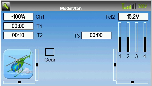
I am not sure if you want placeholders on the main screen or in the preview. If in the preview are only the type of element displayed - this is definitely an error. In previous versions the labels have shown the source choosen for input at boxes, bars and crosses (adn future versions will have this too). Toggles are simply too small to write three values into.
Give me a few more days for reconstructing. I can promise you it will be worth the time.
Please Log in or Create an account to join the conversation.
- Pattaya01
-
- Offline
- Posts: 181
Please Log in or Create an account to join the conversation.
- Pattaya01
-
- Offline
- Posts: 181
Please Log in or Create an account to join the conversation.
- rbe2012
-
Topic Author
- Offline
- So much to do, so little time...
- Posts: 1433
I have made my own icons for this purpose. I have taken tae originals and faded the colors out and made them lighter. So I can see a "shadow" of the icon when the switch is in inactive position and a good viewable one in active position.
Please Log in or Create an account to join the conversation.
- Pattaya01
-
- Offline
- Posts: 181
Please Log in or Create an account to join the conversation.
- rbe2012
-
Topic Author
- Offline
- So much to do, so little time...
- Posts: 1433
Your thoughts are replicable, but in most cases these labels will not easily fit in the existing objects. There are two ways: additional label elements with user configurable text inside or reducing the size of the boxes, bars, ... to make the label fit inside.
But from my personal point of view I believe that most users will want to see the same information for every class of models (helis, planes, gliders, multicopter, ...). Because of this the users will get used to their screen without the labels.
Please Log in or Create an account to join the conversation.
- Pattaya01
-
- Offline
- Posts: 181
When I fly, where do I look? Of course at my model, not on the screen. When do I look the screen? When I setup my model, before I start flying and after I landed.
For me, I just want to start the timer (coupled to the throttle) and have telemetry data that I can see in a glimpse. Most important is audible signals when the voltage drops below a certain level or when the temperature gets too high. So actually, I will probably use a very simple and easy readable main screen anyway.
Having said that, the development for the Devo12 may divert from from the rest as far as GUI is concerned. The 12 has a bigger screen, more and bigger information can be displayed, so I do not see any reason why the core can be compatible to the mainstream development, the GUI is especially for the 12. The work you do now is probably not portable to the other TX's anyway.
Please Log in or Create an account to join the conversation.
- rbe2012
-
Topic Author
- Offline
- So much to do, so little time...
- Posts: 1433
Please Log in or Create an account to join the conversation.
- ave1
-
- Offline
- Posts: 162
If so, would you send me the two or three zip files so I can install your present version of DeviaionTX software, on my 12S.
Or tell me the link where you downloaded those files, please?
This email address is being protected from spambots. You need JavaScript enabled to view it.
Please let me know. rbe2012 does great work, no one to help him very much it appears and I am looking for a more completed version that that I am running now so, I thought Id simply ask you for your vr, please.
Please Log in or Create an account to join the conversation.
- Pattaya01
-
- Offline
- Posts: 181
www.deviationtx.com/forum/builds/1401-de...new-widescreen-build
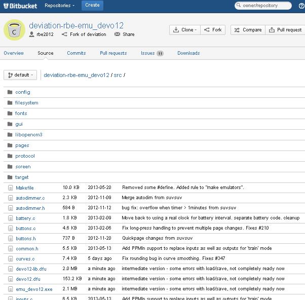
I think what rbe is doing is not yet ready for release. It is an experimental build, only for helicopter, to test his configurable GUI for the Devo12.
A few posts ago he mentioned he needed some more time to re-write the code and will post it when he's done.
Please Log in or Create an account to join the conversation.
- ave1
-
- Offline
- Posts: 162
Thanks
Steve
Please Log in or Create an account to join the conversation.
- Pattaya01
-
- Offline
- Posts: 181
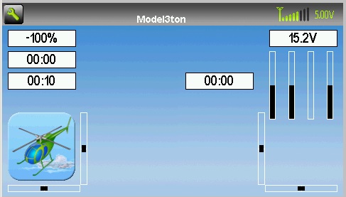
Check one page earlier on this thread and you see what I have been testing from him. The screenshot I put here are from that build, and the labels I just used Paint to modify to make clear what I was meaning. I am using the emulator and did not put it on my Devo12 yet.
Please Log in or Create an account to join the conversation.
- rbe2012
-
Topic Author
- Offline
- So much to do, so little time...
- Posts: 1433
Please Log in or Create an account to join the conversation.
- Pattaya01
-
- Offline
- Posts: 181
Please Log in or Create an account to join the conversation.
-
Home

-
Forum

-
Development

-
Builds

- Devo12 wide screen configurable GUI (intermediate


