Devo12 wide screen configurable GUI (intermediate
- FDR
-
- Offline
Please Log in or Create an account to join the conversation.
- rbe2012
-
Topic Author
- Offline
- So much to do, so little time...
- Posts: 1433
You can use this link: bitbucket start page .
To get to my repo and the page shown above use this: rbe-emu_devo12-source and click on "src" to get to the actual files. You can save them as usual (right click, save as).
When you select "commits" you can see the different development build I have produced (and other's developers builds which I have merged). You can select one by clicking on the hexadecimal number in the column "commit". A new page opens where the binary files will be marked as "binary file changed". The button "view file" at the right lets you download this version.
EDIT: just seen FDR's link hint... he was faster than me...
Please Log in or Create an account to join the conversation.
- Pattaya01
-
- Offline
- Posts: 181
Edit: I tried, but it seems to be a previous version from you, not the one I have tested before. I'll wait for something more complete and with fixed wing support.
Please Log in or Create an account to join the conversation.
- rbe2012
-
Topic Author
- Offline
- So much to do, so little time...
- Posts: 1433
Please Log in or Create an account to join the conversation.
- rbe2012
-
Topic Author
- Offline
- So much to do, so little time...
- Posts: 1433
If you want to test it, you can build it from my repository at bitbucket (link is somewhere above) or you can download the ready-to-run-versions also from bitbucket: https://bitbucket.org/rbe2012/deviation-rbe-emu_devo12/downloads .
You will find a Devo12 version there and also one for Devo8. It is indeed the identical code which runs on both models (besides some different limits and screen positions depending on its size, of course).
I have placed a file "Version_XXXXXXX" there, which indicates the commit I have used to build the files.
Some hints for using:
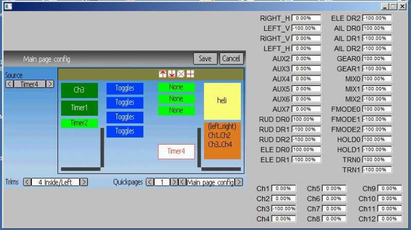
You will see the main config changed. I tried to import the old model configs as exactly as possible. On the Devo12 the 3rd column is not used for old model configs so the screen looks somehow asymmetric...
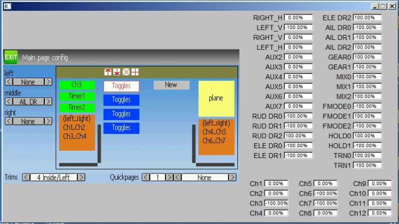
The main config page is completely different to the original deviation firmware versions and a little bit different to my previous versions.
You will find all on one page.
The general settings (which have influence to the main page independently from the objects shown) are at the bottom (trim types and quickpages).
You will see a big preview area with some elements inside. These elements are those which will be displayed at the main page.
There are different kinds of elements: boxes and bars (both in two sizes), icons, toggles, crosses and "NEW" (only visible if a column does not contain any element).
If you select an element (tip / click on it), at the left border some fields and buttons are displayed which can be used to change the properties of the selected element. As far as possible I tried to display these properties in the elements.
Also some small buttons are displayed on top of the column. These can be used to align the selected element on top or bottom, to delete it or to add one. Adding an element always results in a small box which is added at the free space (at top if all elements are bottom aligned, at bottom if all are top aligned, somewhere in between otherwise). New elements can not be added at bottom if they do not fit on the screen; somewhere above always, the non-fitting elements will be shifted out of the screen (can be recovered by deleting the new element).
Tipping / clicking on a previously selected element changes its type (small box -> big box -> icon -> toggles -> cross -> small bars -> high bars and again from the beginning). Element types which will not fit onto the screen will be skipped, also those with a limit (like only one icon allowed, 4 toggles, 3 bars, 2 crosses).
Have fun with it.
I would be happy if I get some feedback (her, via pm or as an issue on bitbucket).
If there were no big issues I would give it to PhracturedBlue to prepare the possible integration in the main code.
Please Log in or Create an account to join the conversation.
- Wene001
-
- Offline
- Posts: 277
but in the Trims & inside/left view i dont like the big gap between the middle two colums.
Sobald ich Trims auf inside/Left stelle wird in der Mitte eine unnatürlich grosse Lücke zwischen den mittleren 2 Spalten.
Ich belege meist die mittleren zwei Spalten mit 2x "Toggles" und drunter "big bars"
Das schaut dann ziemlich komisch aus mit dem grossen Abstand.
Auch ist mir aufgefallen, dass im "big bars" Feld die 4 Balken nicht zentriert sind. Wenn ich drüber die Schalter Icons habe dann sieht man gut dass die Balken drunter seitlich versetzt sind.
Bezüglich des Workarounds mit dem sekündlichen redraw der "Crosses":
Das leichte flackern im Sekundentakt empfinde ich mittlerweile doch eher als störend. Bist du dem eigenlichen Problem schon auf der Spur?
Antwort gerne in Englisch...
Greetz
Thanx again for the hard work
Please Log in or Create an account to join the conversation.
- Pattaya01
-
- Offline
- Posts: 181
If I want to insert more element, how to do?
Edit: Found it, you have to press the + twice....
Please Log in or Create an account to join the conversation.
- Pattaya01
-
- Offline
- Posts: 181
Please Log in or Create an account to join the conversation.
- Pattaya01
-
- Offline
- Posts: 181
Please Log in or Create an account to join the conversation.
- rbe2012
-
Topic Author
- Offline
- So much to do, so little time...
- Posts: 1433
(for the English speaker: the bars in a bar box are not centered).Wene001 wrote: ...im "big bars" Feld die 4 Balken nicht zentriert...
You are right, I use the original bar boxes where the bars are orientated a little left.
I will provide an optimization for this.
Also not my code, but I will look at it.Pattaya01 wrote: ...in the "Button Monitor" there should be a "V"...
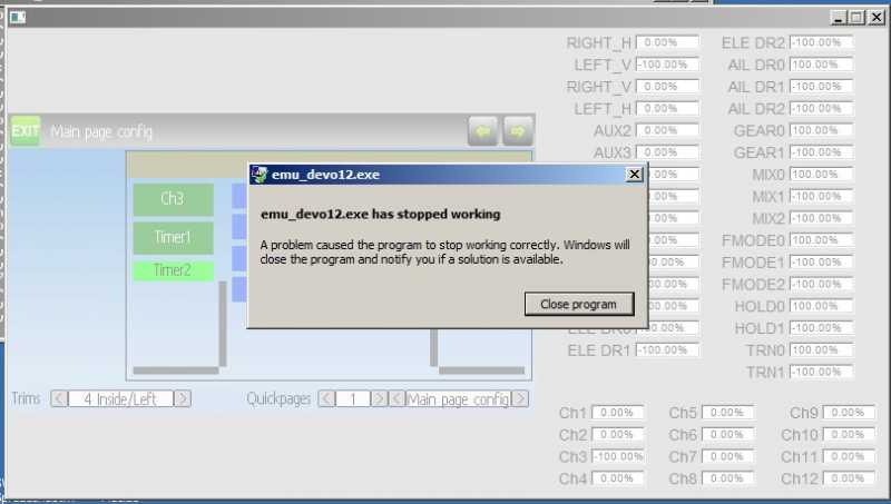
I can reproduce the crash, thank you for the exact steps. I will look into this.
Please Log in or Create an account to join the conversation.
- Pattaya01
-
- Offline
- Posts: 181
Please Log in or Create an account to join the conversation.
- rbe2012
-
Topic Author
- Offline
- So much to do, so little time...
- Posts: 1433
These elements positions are dependent from those above. If you choose different elements above it can't be guaranteed that the elements are at the same y-position.
And I can not (to be honest: I don't want to) examine if in any two columns are two similar elements at nearly the same y-position to align them - there were too much special cases to watch for and the maximum offset should be defined. This would make a calculation of the element's positions much harder.
For such designs I would recommend to place the bar boxes in two columns with identical trims (visible or not) and align them at the bottom.
FYI: I have fixed the bar positions. But the reason for the crash is hard to find (I am quite near, but with fixing it I created some new bugs - I have to look for a new fix or resolve the new...).
Please Log in or Create an account to join the conversation.
- rbe2012
-
Topic Author
- Offline
- So much to do, so little time...
- Posts: 1433
It has still a minimal issue (when leaving empty elements in a column the alignment is not transferred correctly when those elements are automatically removed while rebuilding), but I don't have more time actually to resolve this. But you can workaround with "save" and realign the wrong aligned element(s) and "save" again.
Please Log in or Create an account to join the conversation.
- Pattaya01
-
- Offline
- Posts: 181
Please Log in or Create an account to join the conversation.
- cropduster
-
- Offline
- Posts: 30
Please Log in or Create an account to join the conversation.
- Wene001
-
- Offline
- Posts: 277
I`m using it without issues
@ rbe
Eventually its an idea to create an invisible "Spacer" Box with adjustable height, so everyone can arrange the icons in any vertical position
Please Log in or Create an account to join the conversation.
- rbe2012
-
Topic Author
- Offline
- So much to do, so little time...
- Posts: 1433
Please Log in or Create an account to join the conversation.
- Pattaya01
-
- Offline
- Posts: 181
Please Log in or Create an account to join the conversation.
- Pattaya01
-
- Offline
- Posts: 181
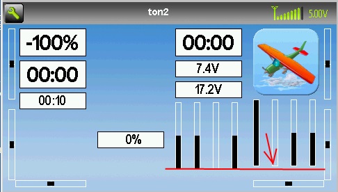
I found one more thing. Took me real patience to capture this in a screen shot, but after 10 times or so I managed the timing
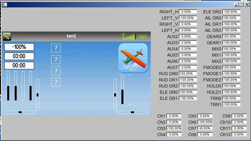
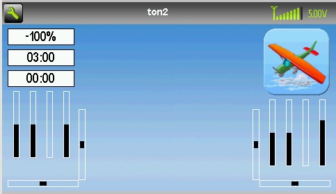
I have created "toggles", but they don't show on the screen. Even I toggle AILDR, ELEVDR, etc, they will not show.
Only during start-up, these boxes with "?" show up for a split second. You can see the screen has not been build up 100%, and after all the elements are placed, they disappear.
Am I doing something wrong? Are these placemarkers? Or is it intentional?
And this is how it looks after the creen has been build up completely:
Please Log in or Create an account to join the conversation.
- rbe2012
-
Topic Author
- Offline
- So much to do, so little time...
- Posts: 1433
I have seen this too and I don't like it, but I have not changed the code there.
I will try to set them invisible when initializing. Maybe that helps.
A grid is an interesting idea, but it will reduce the abilities to place the elements on the screen. The main problem is the different element height and the need for some free space as separators. Grids would force those separator spaces to specific positions and the freedom for using elements will be limited.
I think implementing such a grid will also be hard. There will be more special cases handled and more limit calculation done. For me I have always found a way to design a symmetric and nice screen with the information I want to have.
So: sorry, but I will not implement such a grid. I do like more the idea of Wene about placeholders with configurable size. I will give this a try.
Please Log in or Create an account to join the conversation.
-
Home

-
Forum

-
Development

-
Builds

- Devo12 wide screen configurable GUI (intermediate

