
New deviation logo
- FDR
-
Topic Author
- Offline
Less
More
04 Mar 2013 16:04 #7340
by FDR
I don't insist on the red letters, I just wanted to emphasize the only two letters difference from devention...
Replied by FDR on topic New deviation logo
domcars0 wrote: As PB I'm not really fan of the red, even for the 'ia', but I'm sure it needs a touch of color ... (Grrrrrr.. een?
)
I don't insist on the red letters, I just wanted to emphasize the only two letters difference from devention...
- domcars0
-
- Offline
Less
More
- Posts: 390
04 Mar 2013 16:18 - 04 Mar 2013 16:21 #7341
by domcars0
OK FDR you are forgiven
Heli + Plane , I don't feel it .. this is too 'busy'. May be we can have 2 logos? One with a plane and one with an heli?
The heli is much more funny than the plane, and more in the 'spirit' of the logo with this fonts.
Devo 10 (+7e) owner. It's mine, please don't touch it with your big fingers
Replied by domcars0 on topic New deviation logo
FDR wrote: I don't insist on the red letters, I just wanted to emphasize the only two letters difference from devention...
OK FDR you are forgiven
Heli + Plane , I don't feel it .. this is too 'busy'. May be we can have 2 logos? One with a plane and one with an heli?
The heli is much more funny than the plane, and more in the 'spirit' of the logo with this fonts.
Devo 10 (+7e) owner. It's mine, please don't touch it with your big fingers
Last edit: 04 Mar 2013 16:21 by domcars0.
- Hexperience
-
- Offline
Less
More
- Posts: 588
04 Mar 2013 16:42 - 04 Mar 2013 16:45 #7342
by Hexperience
WIN! Love it... I like the red too.
The plane and heli could be interchangeable so to speak.. If for example I wanted to print a sticker I could cut out which ever one I wanted...
Great job.
There are 10 types of people in this world. Those that understand binary and those that don't.
Replied by Hexperience on topic New deviation logo
FDR wrote: Well, it was a bit harder:

WIN! Love it... I like the red too.
The plane and heli could be interchangeable so to speak.. If for example I wanted to print a sticker I could cut out which ever one I wanted...
Great job.
There are 10 types of people in this world. Those that understand binary and those that don't.
Last edit: 04 Mar 2013 16:45 by Hexperience.
- Hexperience
-
- Offline
Less
More
- Posts: 588
04 Mar 2013 17:07 - 04 Mar 2013 17:15 #7344
by Hexperience
There are 10 types of people in this world. Those that understand binary and those that don't.
Replied by Hexperience on topic New deviation logo
I really wish I could concentrate on my work.. I know I'm going to get fired sooner or later... 
FDR, you could do new default icons to!!")
FDR, you could do new default icons to!!
There are 10 types of people in this world. Those that understand binary and those that don't.
Last edit: 04 Mar 2013 17:15 by Hexperience.
- rbe2012
-
- Offline
- So much to do, so little time...
Less
More
- Posts: 1433
04 Mar 2013 17:13 #7345
by rbe2012
Replied by rbe2012 on topic New deviation logo
I like it too but the red is not perfect in my eyes. Having two versions in respect to personal preferences for flying objects is a good idea too, maybe better than having two icons there (and a third for the quad flyer?).
But what I don't like is the gap in the mirrored text where the ia should be... hardly to see.
But what I don't like is the gap in the mirrored text where the ia should be... hardly to see.
- PhracturedBlue
-
- Offline
Less
More
- Posts: 4403
04 Mar 2013 19:07 #7347
by PhracturedBlue
Replied by PhracturedBlue on topic New deviation logo
Nice. can you put the plane to the left of the 'deviation', remove the 'definetly different' and see how it looks?
Also I'd be interested in seeing it without the red 'ia' which doesn't seem to have much meaning.
I don't mean to be a back-seat driver. When I get some free time, I'll play with it myself.
Also I'd be interested in seeing it without the red 'ia' which doesn't seem to have much meaning.
I don't mean to be a back-seat driver. When I get some free time, I'll play with it myself.
- FDR
-
- Offline
04 Mar 2013 19:29 #7348
by FDR
Replied by FDR on topic New deviation logo
Here you are, however I did it the other way, because it looked better:

- Hexperience
-
- Offline
Less
More
- Posts: 588
04 Mar 2013 19:37 - 04 Mar 2013 19:40 #7349
by Hexperience
There are 10 types of people in this world. Those that understand binary and those that don't.
Replied by Hexperience on topic New deviation logo
One thing is for sure... no one will mistake that font for Walkeras...
I know nothing about fonts, but is it possible to actually use that font on the devo8 or devo12?
I know nothing about fonts, but is it possible to actually use that font on the devo8 or devo12?
There are 10 types of people in this world. Those that understand binary and those that don't.
Last edit: 04 Mar 2013 19:40 by Hexperience.
- FDR
-
- Offline
04 Mar 2013 19:39 #7350
by FDR
Yep, that was the primary goal...
Replied by FDR on topic New deviation logo
Hexperience wrote: One thing is for sure... no one will mistake that font for Walkeras...
Yep, that was the primary goal...
- Hexperience
-
- Offline
Less
More
- Posts: 588
04 Mar 2013 19:56 - 04 Mar 2013 19:57 #7351
by Hexperience
There are 10 types of people in this world. Those that understand binary and those that don't.
Replied by Hexperience on topic New deviation logo
Sorry.. I was editing my post while you answered, what do you think about the fonts? It it possible to use it in the devo8 or 12? I'm pretty sure it's too detailed, but thought I would ask.
There are 10 types of people in this world. Those that understand binary and those that don't.
Last edit: 04 Mar 2013 19:57 by Hexperience.
- FDR
-
- Offline
04 Mar 2013 20:03 #7352
by FDR
Replied by FDR on topic New deviation logo
It's the "Curlz MT", and it's an OpenType ttf with 68KB size.
It came with Photoshop, and probably it's licence prohibits using it elsewhere...
It came with Photoshop, and probably it's licence prohibits using it elsewhere...
- Hexperience
-
- Offline
Less
More
- Posts: 588
04 Mar 2013 22:18 #7361
by Hexperience
There are 10 types of people in this world. Those that understand binary and those that don't.
Replied by Hexperience on topic New deviation logo
Just for fun... this is a mspaint markup... NOT in the code..
There are 10 types of people in this world. Those that understand binary and those that don't.
- RoGuE_StreaK
-
- Offline
Less
More
- Posts: 486
04 Mar 2013 23:01 #7362
by RoGuE_StreaK
Replied by RoGuE_StreaK on topic New deviation logo
How are these non-block logos going to go on the monochrome displays of the 10 and 7E?
On that topic, are the displays only monochrome, are can they support greyscale? Was trying to create some model icons yesterday, very hard to do anything with purely black and white without antialiasing.
PS. I was going to say that a good program for comparing the look of the same text using all of your installed fonts is "FontLister", but I just redownloaded it and it doesn't seem to have the "compare all" function anymore! But if you can track down an old version, it was very good for this; just enter your text and you'd see it styled for every installed font in a big list.
On that topic, are the displays only monochrome, are can they support greyscale? Was trying to create some model icons yesterday, very hard to do anything with purely black and white without antialiasing.
PS. I was going to say that a good program for comparing the look of the same text using all of your installed fonts is "FontLister", but I just redownloaded it and it doesn't seem to have the "compare all" function anymore!
- PhracturedBlue
-
- Offline
Less
More
- Posts: 4403
05 Mar 2013 01:56 #7365
by PhracturedBlue
Replied by PhracturedBlue on topic New deviation logo
The displays are b&w not grey-scale. And thelogo likely won't go on those displays. the current logo isn't on the display either (even the devo8)RoGuE_StreaK wrote: How are these non-block logos going to go on the monochrome displays of the 10 and 7E?
- PhracturedBlue
-
- Offline
Less
More
- Posts: 4403
05 Mar 2013 03:27 #7366
by PhracturedBlue
Replied by PhracturedBlue on topic New deviation logo
I like this. But I'll sit on it for a bit and wait to see what others think.FDR wrote: Here you are, however I did it the other way, because it looked better:
- LeDub
-
- Offline
Less
More
- Posts: 5
05 Mar 2013 03:46 #7367
by LeDub
Replied by LeDub on topic New deviation logo
Its nice, for a fairytale, not a Tx. I think the curvy design is too "romantic" and doesn't really represent the product group.
Don't want offend, I just give my 2 cents.
Don't want offend, I just give my 2 cents.
- vlad_vy
-
- Offline
Less
More
- Posts: 3333
05 Mar 2013 03:55 #7368
by vlad_vy
Replied by vlad_vy on topic New deviation logo
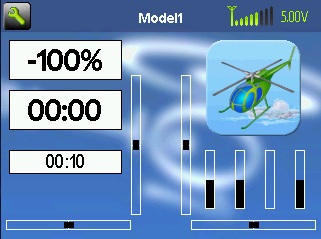
Nice picture, but too funny for my liking. It will be better to add semitransparent clouds around (or under) heli and plane.
- rbe2012
-
- Offline
- So much to do, so little time...
Less
More
- Posts: 1433
05 Mar 2013 06:41 #7373
by rbe2012
Replied by rbe2012 on topic New deviation logo
I like it too. It's funny, undoubtedly. But deviation is no product to sell, it is a project to have fun with - regardless of whether you develop or use. And we all take deviation seriously nevertheless.
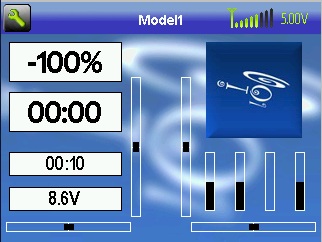
The curls are a good picture to describe how the development is done - turning around while looking in any direction and getting closer to it. It is also a good allegory how the flight experiences grow... sometimes straight forward and then it ends in some too quick turns (this often happens to me at least).
The curls are a good picture to describe how the development is done - turning around while looking in any direction and getting closer to it. It is also a good allegory how the flight experiences grow... sometimes straight forward and then it ends in some too quick turns (this often happens to me at least).
- Mullson
-
- Offline
Less
More
- Posts: 114
05 Mar 2013 11:29 #7386
by Mullson
Replied by Mullson on topic New deviation logo
I like it to but would prefer a more strict approach. And also only start with a font and then develop. Changing the lines and curves further to make it more personal and special.
I really love the heli and the way it forms the word "joi".
I really love the heli and the way it forms the word "joi".
- FDR
-
- Offline
Time to create page: 0.316 seconds
-
Home

-
Forum
-
Model Configs, Templates, Skins
-
Custom Skins
- New deviation logo