
GUI
- FDR
-
- Offline
event_key(): FL_KP+'^M'
event_text(): ^M
On XP the numpad's enter gives the same:
event_key(): FL_KP+'^M'
event_text(): ^M
...while main enter gives:
event_key(): FL_Enter
event_text(): ^M
BTW: this is on different machines with different keyboards...
- FDR
-
- Offline
Could it be drawn around the box, please?
EDIT: Nevermind! I have changed it's color to red, so it is perfect now...
- PhracturedBlue
-
- Offline
- Posts: 4403
This was my original plan, but it adds some complication, and when I tried it the way it is, it looked pretty good. So while yes we could do that, my answer for the moment is that is is up to the gui customization folks to work with what they've got (and as you noticed, by configuring the color, you can hopefully make do.FDR wrote: One more problem of mine: since my buttons are almost perfect rectangles and they fill the button size, your selection border (which is drawn inside the picture bounds) is not visible at all.
Could it be drawn around the box, please?
EDIT: Nevermind! I have changed it's color to red, so it is perfect now...
- FDR
-
- Offline
May I do it?
Also I need a normal size bold font too...
Could you make the selection to scroll throw the controls round and round in both direction?
Sometimes it would be easier to go to the ok or cancel if it would start over after the end...
- PhracturedBlue
-
- Offline
- Posts: 4403
what do you mean by normal size bold? There is a proportional "arial14bold" which should complement the default 'arial14' and there is a fixed-width "system8x8bold"FDR wrote: I would like to align some controls on your pages, if you don't mind!
May I do it?
Also I need a normal size bold font too...
Sure. I'll work on thatCould you make the selection to scroll throw the controls round and round in both direction?
Sometimes it would be easier to go to the ok or cancel if it would start over after the end...
- PhracturedBlue
-
- Offline
- Posts: 4403
- FDR
-
- Offline
I've checked in a lot of changes in the pages.
However I've changed the skin too (because it is much easier to align boxes, if they are square
I don't know if you like it, and if not, then how to get the changes without the new skin, but I guess, you can manage it.
- FDR
-
- Offline
I would use it for the titles as "Trim" or the channel name being edited.PhracturedBlue wrote: what do you mean by normal size bold? There is a proportional "arial14bold" which should complement the default 'arial14' and there is a fixed-width "system8x8bold"
I know there is a bold font, it's just not loaded.
I guess it should go into the config.ini like for example:
[font]
  color=000000
  font=arial14bold
...then the NUM_LABELS should be increased, and a constant defined for it.
Am I right?
- PhracturedBlue
-
- Offline
- Posts: 4403
Yes, and that is already available (at least for buttons, text-select, and list-boxes). What you probably don't have yet is the ability to specify different fonts for different text widgets. If you tell me which text strings/widgets you want to be configurable, I'll work on giving you configuration of them.FDR wrote: I would use it for the titles as "Trim" or the channel name being edited.
I know there is a bold font, it's just not loaded.
I guess it should go into the config.ini like for example:[font] color=000000 font=arial14bold
...then the NUM_LABELS should be increased, and a constant defined for it.
Am I right?
Or you can do it just like you described.
We also need to figure out how to internationalize the firmware to support multiple languages. The ini format is ideal to support that from a user-entry perspective, but not from a performance perspective (unless all strings are stored in RAM, which is an option, as we still have lots free)
- FDR
-
- Offline
More comment on this:FDR wrote: I've checked in a lot of changes in the pages.
I've arranged the controls to an 8 pixel grid, because it is a practical divider of the screen and most of our controls.
Only the two large buttons don't apply to this, they are 90 and 45 pixels wide. Can we resize them to align better? Say 96 and 48?
Also I have made some more room in the upper part for a proper title/header section...
- PhracturedBlue
-
- Offline
- Posts: 4403
Sure. you can even do that yourself. in gui.c at the top you'll see a list of all bmps, and their sizes. just change 90 and 46 to 96 and 48 (note that it is actually 46 instead of 45 because the code can't handle an odd-sized bmp properly).FDR wrote: Only the two large buttons don't apply to this, they are 90 and 45 pixels wide. Can we resize them to align better? Say 96 and 48?
you can then optionally search-replace FILE_BTN46_24 appropriately, or I'll do it when i merge your changes.
- FDR
-
- Offline
- PhracturedBlue
-
- Offline
- Posts: 4403
- FDR
-
- Offline
Well, I tried them all, but none is much better.PhracturedBlue wrote: They look good. I don't really like the red though. I don't think it has enough contrast. Perhaps yellow, green, or white as the highlight color would be better for your buttons.
White and yellow give similar results: a tiny bit more contrast, but less obtrusive...
- PhracturedBlue
-
- Offline
- Posts: 4403
As you mentioned, we should support a model icon on the main page which should be clickable to enter editing mode (probably going directly to the load/save page. All other settings can probably be accessed through menus.
As I mentioned before, I think a mock-up would be the best way for me to visualize what you'd like, and I can start work on it. But I'm logging out for the night now.
- FDR
-
- Offline
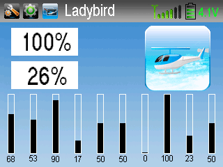
I will post a few variants. Now I have an unfinished one:
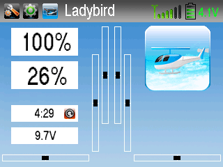
It has a header, where the shortcuts are, plus the battery and power info.
The content of the white boxes would be configurable, in this case: throttle, pitch, timer, telemetry voltage...
...and another one:
- PhracturedBlue
-
- Offline
- Posts: 4403
* Isnt' the battery bar redundant with the voltage?
* We can't actually use Walkera's images in our library. I need freely available images.
* One of the limitations of the GUI is that you can't draw transparent objects on top of another object (originally we supported this, but it is very slow, so I disabled it). so you can't have transparent bmps or text on top of another bmp. To achieve the header bar we could:
a) embed it into the background. In that case, all screens would have it.
b) use a 2nd background. That is a lot of ROM to spend in my opinion
c) enhance the GUI further to support this. I have a couple of ideas on what we might do, but it is certainly easier if I don't need to.
* I don't have fonts that look like that. It'd would be really helpful if you could work on the fonts. It isn't all that difficult to do, but does take some time.
The program I use is 'GLCD Font Creator'. It is available here:
www.mikroe.com/eng/products/view/683/glcd-font-creator/
You can import any font on your PC to use as a reference, but they generally have too much whitespace on the top, bottom, and left (right doesn't matter, as it gets stripped out. So I import a font as a starting point, and then adjust each character as needed. For larger fonts, I only import the numbers (0-9 % , .) as they take up a lot of space.
Anyhow if you want to give it a shot, it'd be helpful. Otherwise I'll work on the layout with the fonts I currently have for now.
- FDR
-
- Offline
Bitmaps are easier to receipt. But! It can only give a visual warning about the battery level, however different type of batteries can be used: 1s, 2s or 3s LiPo, 4s NiMh, 4s alkaline, etc. They all have different voltage levels for the bars of the indicator, so the voltage reading is useful. The best solution would be if we could automatically detect the battery type, and set the levels accordingly (or at least to allow to set the battery type).PhracturedBlue wrote: Those are both reasonably straight forward but:
* Isnt' the battery bar redundant with the voltage?
OK, don't worry, it's just a mockup! It was quicker to use them, than draw one...PhracturedBlue wrote: * We can't actually use Walkera's images in our library. I need freely available images.
No problem.PhracturedBlue wrote: * One of the limitations of the GUI is that you can't draw transparent objects on top of another object (originally we supported this, but it is very slow, so I disabled it). so you can't have transparent bmps or text on top of another bmp. To achieve the header bar we could:
a) embed it into the background. In that case, all screens would have it.
b) use a 2nd background. That is a lot of ROM to spend in my opinion
c) enhance the GUI further to support this. I have a couple of ideas on what we might do, but it is certainly easier if I don't need to.
IMO the header would be useful on all the other pages too: it could contain the OK/Cancel (or Load/Save/Cancel) buttons, and would separate the page title.
Only difficulty is with those pages, that should be scrollable, because on that the header should remain on top, and only the contents below should scroll...
The font usage is not intentional. I've just used what was selected. No significance...PhracturedBlue wrote: * I don't have fonts that look like that. It'd would be really helpful if you could work on the fonts. It isn't all that difficult to do, but does take some time.
The question was: how do you like the concept?
There could be some more such templates to choose from, and some elements of the templates would be configurable...
EDIT: For example you could change between these main screen layouts with the left/right buttons, but the default layout for the model should be configured in the model data...
- PhracturedBlue
-
- Offline
- Posts: 4403
scrolling is one option, but an easier one (and the one I planned for) is to have multiple 'pages' for each menu. There would be a up/down arrow on each page that would bring up the next page. We probably need a '1-of-n' type text as well. My only concern is that paging will be slow with the buttons. maybe a long-pess up/down could switch to the next page.FDR wrote:
No problem.PhracturedBlue wrote: * One of the limitations of the GUI is that you can't draw transparent objects on top of another object (originally we supported this, but it is very slow, so I disabled it). so you can't have transparent bmps or text on top of another bmp. To achieve the header bar we could:
IMO the header would be useful on all the other pages too: it could contain the OK/Cancel (or Load/Save/Cancel) buttons, and would separate the page title.
Only difficulty is with those pages, that should be scrollable, because on that the header should remain on top, and only the contents below should scroll...
Another possibility is to use a listbox-like widget that you can draw inside of, but that only allows the equivalent of pageup/pagedown within it (this is similar to the above but could be for only a specific area on the screen)
The 3rd possibiliy is to use a list-widget where all items are built in rows so that I can advance one row at a time.
The 2nd and 3rd options are both possible, but require some additional work. the 1st option can be done with existing widgets.
I think they look fine, though perhaps the main screen is too similar to the Devo. but maybe that is just because they got it right.The question was: how do you like the concept?
There could be some more such templates to choose from, and some elements of the templates would be configurable...
I would absolutely allow configuration of widgets on the main page. probably not placement, but as you said, the contents of the text boxes, and the ability to enable/disable given widgets.
I'm also not sure about the shortcut bottons at the top. I think they'd be too small to easily use via touch, and we won't allow button selection with the physical buttons on the main screen (I like your idea of using a long-enter press to enter the menu from the main screen). I owuldn't want to make them much bigfger as they'll strat interfering with the Model name. We would still need a way to get to the menu via the touch-screen, but perhaps a better option would be a single button which could be larger, or even any press on the top-bar.
I'm still not convinced about the battery indicator. Don't most folks get 10hrs or so out of a transmitter charge? In which case how often do you care about the transmitter voltage that you need to be able to read it at a glance? I think either text or bitmap, but not both will be sufficient, but it isn't exactly the most important topic.
- FDR
-
- Offline
Yes, paging is fine too.PhracturedBlue wrote: scrolling is one option, but an easier one (and the one I planned for) is to have multiple 'pages' for each menu. There would be a up/down arrow on each page that would bring up the next page. We probably need a '1-of-n' type text as well. My only concern is that paging will be slow with the buttons. maybe a long-pess up/down could switch to the next page.
Another possibility is to use a listbox-like widget that you can draw inside of, but that only allows the equivalent of pageup/pagedown within it (this is similar to the above but could be for only a specific area on the screen)
The 3rd possibiliy is to use a list-widget where all items are built in rows so that I can advance one row at a time.
The 2nd and 3rd options are both possible, but require some additional work. the 1st option can be done with existing widgets.
You don't even need paging buttons: if you are on the last button and press down or right to step to the next, the program can change to the next page. Of course paging buttons are useful for the pencil, but in this case they should NOT (edit) be in the tab sequence...
If you think about, this automatic paging can be implemented as scrolling, if the pages are overlapping each other except one-two rows of buttons. Every page would have an up and down button on the right side, and you draw some decorational scroll position box between them, and it is done!
I think yes, it is good indeed. I have only some minor complaints about it, most of them are about the menu structure inherited from the 2801. They splitted the functions into model, function and system menu, but they are sometimes in the wrong place, and the separation makes it too complicated to navigate between them.PhracturedBlue wrote: I think they look fine, though perhaps the main screen is too similar to the Devo. but maybe that is just because they got it right.
Furthermore, don't forget, that all our users will come to the deviation fw from the walkera one. It doesn't hurt, if it is something familiar. Makes the learning curve easier...
If you like the long enter for the menu, than it is good enough...PhracturedBlue wrote: I'm also not sure about the shortcut bottons at the top. I think they'd be too small to easily use via touch, and we won't allow button selection with the physical buttons on the main screen (I like your idea of using a long-enter press to enter the menu from the main screen). I owuldn't want to make them much bigfger as they'll strat interfering with the Model name. We would still need a way to get to the menu via the touch-screen, but perhaps a better option would be a single button which could be larger, or even any press on the top-bar.
I have placed three buttons on the header, but we might not need all of them. Even in the original fw you can click on the model name to select a model, and on the picture itself to edit the model (plus on the power indicator to edit the power amplifier, etc), so we will have enough large areas to click on, and the rest of the header could be all entering the menu...
PhracturedBlue wrote: I'm still not convinced about the battery indicator. Don't most folks get 10hrs or so out of a transmitter charge? In which case how often do you care about the transmitter voltage that you need to be able to read it at a glance? I think either text or bitmap, but not both will be sufficient, but it isn't exactly the most important topic.
OK, it's not that important for me either!
If I have to choose, I think the text is more important.