
- Posts: 4403
PB's newgui
- PhracturedBlue
-
- Offline
Less
More
19 Jun 2013 19:45 #11136
by PhracturedBlue
Replied by PhracturedBlue on topic PB's newgui
What do you think about having an 'Empty' template available with the default template?
Then I don't need to have a dialog called from a dialog, which is a bit kludgey.
It would also be somewhat difficult to accidently press, which is my main concern.
The problem with an 'Add' button, is it isn't very convenient from a keyboard perspective. You'd select your element type, then move over to add and press it.
Using a 'press' spinbox' would let you just press enter after selecting the relevant element.
The alternative is to play some games with the button bindings, but this is a bit nasty when it comes to overriding bindings within a dialog.
- Kdean
-
- Offline
Less
More
- Posts: 213
19 Jun 2013 20:49 #11137
by Kdean
Replied by Kdean on topic PB's newgui
I for one am not particular about how the display is configured. What ever changes made from here forward will only be matters of convenience and preference. Im all for implementations that will not complicate the programing. I can work around not having the convenient features, setting up the GUI for a model only needs to be done once like someone said earlier. Press and hold, drag and drop, blow and squeeze, it does not matter to me, as long as it works and it is stable. We can end up spending alot of time "trying" different ways to get the same results.
Here are the things i would like to see developed for the firmware.
1) Built in real time clock. Either displayed in the menu bar or can be programed in one of the timers display.
2) Text boxes. Size adjustable so they can be used to label other boxes, add channel numbers to bargraphs, or display notes about the model.
3) Horizontal bargraphs. Or circular ones to represent the knobs position at the top of the 12s
4) Small square boxes. About the size of the toggles. To be used to display the percentage of rate, expo, or gyro that is programed with the switch position.
I would love to have a dfu release that i can uses in my 12s now. Then the programing work can continue while i play with it some more in real world situations.
- FDR
-
Topic Author
- Offline
19 Jun 2013 20:52 #11138
by FDR
Just like in case of selecting a template, the dialog would close when you press "Erase", and the confirmation dialog would be opened with "OK" and "Cancel" buttons. If you press ok, it clears the screen, otherwise leave the contents, but would not return to the previous dialog.
The empty template would do, but that could be selected by a mistake too...
I'm fine with the pressable spinbox, which could get an "Add" label before, but I see some users have difficulty with them...
Replied by FDR on topic PB's newgui
It is not necessary to open the confirmation dialog on top of the other one.PhracturedBlue wrote: What do you think about having an 'Empty' template available with the default template?
Then I don't need to have a dialog called from a dialog, which is a bit kludgey.
It would also be somewhat difficult to accidently press, which is my main concern.
Just like in case of selecting a template, the dialog would close when you press "Erase", and the confirmation dialog would be opened with "OK" and "Cancel" buttons. If you press ok, it clears the screen, otherwise leave the contents, but would not return to the previous dialog.
The empty template would do, but that could be selected by a mistake too...
You are right about the keyboard handling.PhracturedBlue wrote: The problem with an 'Add' button, is it isn't very convenient from a keyboard perspective. You'd select your element type, then move over to add and press it.
Using a 'press' spinbox' would let you just press enter after selecting the relevant element.
I'm fine with the pressable spinbox, which could get an "Add" label before, but I see some users have difficulty with them...
- PhracturedBlue
-
- Offline
Less
More
- Posts: 4403
19 Jun 2013 20:58 - 19 Jun 2013 21:00 #11139
by PhracturedBlue
I think I'll do it that way.
As far as the 'Add' button, I could have a pressable spin-box AND an 'Add' button that both behave the same. In the end this probably isn't that critical, since a mistake is very easy to correct.
I could also have an 'Add' button that starts with focus. needing 2 select the type, change it, then select 'Add' isn't that bad if you can quickly add the 2nd or 3rd subsequent element with one press.
I want to wrap up the interface so I can start work on porting it to the Devo10, which is the next critical step before I can merge the changes.
As far as adding an icon to get to the edit screen, I agree it is a good idea, but it puts us back into being really-cramped on the header on the devo8.
Replied by PhracturedBlue on topic PB's newgui
Selecting from a listbox requires selecting the item then moving to ok and pressing it. I guess you could press 'Ok' instead of 'Cancel' but those buttons are quite big, and harder to miss.FDR wrote: The empty template would do, but that could be selected by a mistake too...
I think I'll do it that way.
As far as the 'Add' button, I could have a pressable spin-box AND an 'Add' button that both behave the same. In the end this probably isn't that critical, since a mistake is very easy to correct.
I could also have an 'Add' button that starts with focus. needing 2 select the type, change it, then select 'Add' isn't that bad if you can quickly add the 2nd or 3rd subsequent element with one press.
I want to wrap up the interface so I can start work on porting it to the Devo10, which is the next critical step before I can merge the changes.
As far as adding an icon to get to the edit screen, I agree it is a good idea, but it puts us back into being really-cramped on the header on the devo8.
Last edit: 19 Jun 2013 21:00 by PhracturedBlue.
- FDR
-
- Offline
19 Jun 2013 21:16 #11140
by FDR
Replied by FDR on topic PB's newgui
I hope it would take less space, then the spinbox took...PhracturedBlue wrote: As far as adding an icon to get to the edit screen, I agree it is a good idea, but it puts us back into being really-cramped on the header on the devo8.
- PhracturedBlue
-
- Offline
Less
More
- Posts: 4403
19 Jun 2013 22:03 #11141
by PhracturedBlue
The icon takes up less space than the spinbox, but we didn't have the 'Plus', and the left/right didn't fit properly. So we replaced the spinbox with 3 icons already ('add' 'left' and 'right'). Now we add a 4th ('Edit') and it is cramped again. Anyhow, I added it and it does fit ok. Let me know what you think
Replied by PhracturedBlue on topic PB's newgui
I checked in all the fixes above.FDR wrote:
I hope it would take less space, then the spinbox took...PhracturedBlue wrote: As far as adding an icon to get to the edit screen, I agree it is a good idea, but it puts us back into being really-cramped on the header on the devo8.
The icon takes up less space than the spinbox, but we didn't have the 'Plus', and the left/right didn't fit properly. So we replaced the spinbox with 3 icons already ('add' 'left' and 'right'). Now we add a 4th ('Edit') and it is cramped again. Anyhow, I added it and it does fit ok. Let me know what you think
- PhracturedBlue
-
- Offline
Less
More
- Posts: 4403
19 Jun 2013 23:00 #11142
by PhracturedBlue
Replied by PhracturedBlue on topic PB's newgui
I updated the download link again with a new version of the emulator.
I believe this addresses all feedback to date with regards to the new layout gui.
Sorry, but the completion of the Devo12 interface for other pages, as well as the addition of new gui widgets is not next on my todo list, so these requests will likely need to wait.
I believe this addresses all feedback to date with regards to the new layout gui.
Sorry, but the completion of the Devo12 interface for other pages, as well as the addition of new gui widgets is not next on my todo list, so these requests will likely need to wait.
- ave1
-
- Offline
Less
More
- Posts: 162
19 Jun 2013 23:27 #11143
by ave1
Replied by ave1 on topic PB's newgui
WOW
Easy to use, intuitive, no complaints from a simple FBL heli guy. It's really come a long way. Excellent result. I'm so impressed and proud for you all and this.
Easy to use, intuitive, no complaints from a simple FBL heli guy. It's really come a long way. Excellent result. I'm so impressed and proud for you all and this.
- Kdean
-
- Offline
Less
More
- Posts: 213
20 Jun 2013 00:31 - 20 Jun 2013 00:40 #11144
by Kdean
Replied by Kdean on topic PB's newgui
Im playing with the new emu, after using my radio for a bit, i feel that in the page config pop up windows the delete/add button is very close to the spin buttons, and the rows are also very close. We all know the accuracy of the touch screen on these devices can sometimes miss by a little, or alot. I can see that i will accidentally delete something while trying to adjust something else.
Maybe a cancel button on the bottom can allow the changes not to be saved so that any miss press will not lead to having to rebuild/replace an item in the case of a miss cue. Cancel will return to setup page previous state with no changes.
It would be to easy to press a wrong button on a screen like this...
In addition to the cancel button, maybe just spread things out as well.
Last edit: 20 Jun 2013 00:40 by Kdean.
- PhracturedBlue
-
- Offline
Less
More
- Posts: 4403
20 Jun 2013 00:48 #11145
by PhracturedBlue
Replied by PhracturedBlue on topic PB's newgui
a cancel button is difficult to implement as we would nee to keep track of all changes, which will waste a lot of RAM. spacing out the buttons is not too hard to do though
- Kdean
-
- Offline
Less
More
- Posts: 213
20 Jun 2013 01:16 - 20 Jun 2013 01:41 #11146
by Kdean
Replied by Kdean on topic PB's newgui
Can you add "short cuts" to pages from toggles?
Press toggle icon for flight mode = 3-thr complex page
Press rudder dr icon = 4-rud expo&dr page
Quick access to the assignment that the switch is set for.
And what happend to the four main menu "quick pages"?
Press toggle icon for flight mode = 3-thr complex page
Press rudder dr icon = 4-rud expo&dr page
Quick access to the assignment that the switch is set for.
And what happend to the four main menu "quick pages"?
Last edit: 20 Jun 2013 01:41 by Kdean.
- Kdean
-
- Offline
Less
More
- Posts: 213
20 Jun 2013 01:24 #11147
by Kdean
Replied by Kdean on topic PB's newgui
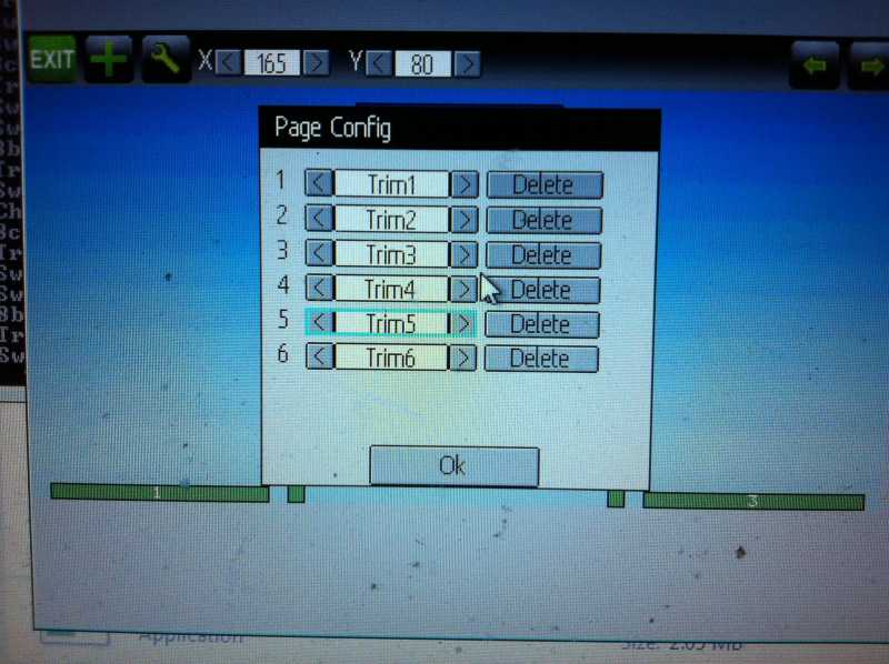
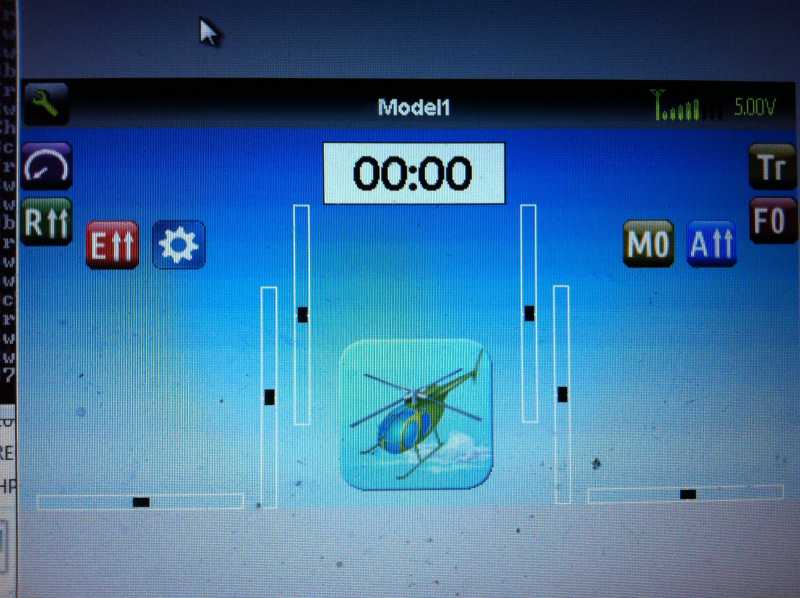
Sample of a simple gui setup, showing all trim and switch positions.
- Kdean
-
- Offline
Less
More
- Posts: 213
20 Jun 2013 01:39 #11148
by Kdean
Replied by Kdean on topic PB's newgui
Sample of a more detailed setup, including telemetry, with bargraphs for dials and knobs.
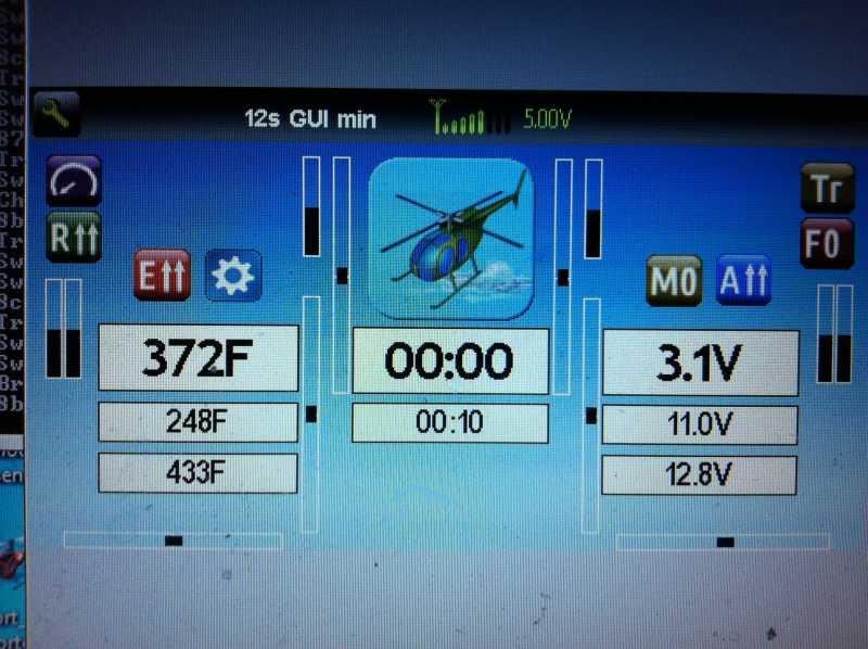
This was done on older version of the EMU.
This was done on older version of the EMU.
- Pattaya01
-
- Offline
Less
More
- Posts: 181
20 Jun 2013 01:49 - 20 Jun 2013 01:50 #11149
by Pattaya01
Replied by Pattaya01 on topic PB's newgui
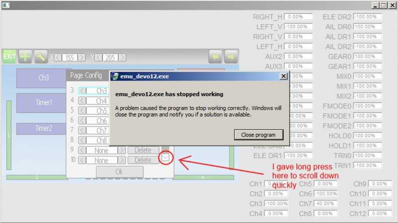
I was placing 12 bargraphs at the bottom of the screen, started to assign channels, did a long press on the scroll down and had a crash. This is your latest build.
Last edit: 20 Jun 2013 01:50 by Pattaya01.
- Kdean
-
- Offline
Less
More
- Posts: 213
20 Jun 2013 02:17 - 20 Jun 2013 02:18 #11150
by Kdean
Replied by Kdean on topic PB's newgui
Shouldn't the telemetry alarms turn the display red like the timer displays do?
It would be nice so that an alarm goes off, and with a quick glance you can see why.
It would be nice so that an alarm goes off, and with a quick glance you can see why.
Last edit: 20 Jun 2013 02:18 by Kdean.
- Kdean
-
- Offline
Less
More
- Posts: 213
20 Jun 2013 02:56 #11151
by Kdean
Replied by Kdean on topic PB's newgui
I was able to duplicate the long press scroll-crash. It also happened when tried it with a toggle list that took up more than one screen.
- rbe2012
-
- Offline
- So much to do, so little time...
Less
More
- Posts: 1433
20 Jun 2013 06:14 #11159
by rbe2012
For my gui I have written a converter which is triggered when a model was loaded without the advanced gui section. It recalculates the old config to the new one (see "CONFIG_UpdateGUI()" in model.c).
Maybe you want to take a look (or have done already) - from my point of view it's not too complicated - just a bundle of if-statements and variable assignments.
Replied by rbe2012 on topic PB's newgui
PhracturedBlue wrote: ...I don't see any way to make supporting the old gui possible now without a lot of crufty code. instead I will just use the default.ini if I don't find the new-gui section in the model.ini...
For my gui I have written a converter which is triggered when a model was loaded without the advanced gui section. It recalculates the old config to the new one (see "CONFIG_UpdateGUI()" in model.c).
Maybe you want to take a look (or have done already) - from my point of view it's not too complicated - just a bundle of if-statements and variable assignments.
- rbe2012
-
- Offline
- So much to do, so little time...
Less
More
- Posts: 1433
20 Jun 2013 06:49 #11160
by rbe2012
I have reworked some of the other pages. I will check if they are still compatible to the actual progress (they are mostly independent from the main page so why not...) and file them as enhancements in bitbucket.
Replied by rbe2012 on topic PB's newgui
PhracturedBlue wrote: ...Sorry, but the completion of the Devo12 interface for other pages, as well as the addition of new gui widgets is not next on my todo list, so these requests will likely need to wait.
I have reworked some of the other pages. I will check if they are still compatible to the actual progress (they are mostly independent from the main page so why not...) and file them as enhancements in bitbucket.
- FDR
-
- Offline
20 Jun 2013 09:13 - 20 Jun 2013 13:00 #11163
by FDR
I have two remarks left unsolved:
About the 11. it would do if the long press didn't work on elements other then selected, but it would be better if the long press could change selection...
A few more new:
13. It is good that you can't change the coordinates when no element is selected, but then the spinboxes could be replaced with simple textboxes to indicate that.
14. A really minor cosmetic one: the add element dialog would be nicer if the "Cancel" button would be aligned with the "Load" button. I know it is because the cancel button is right in the middle, but with a little change of the dialog width could manage it, probably together with spacing out the buttons...
Replied by FDR on topic PB's newgui
PhracturedBlue wrote: I believe this addresses all feedback to date with regards to the new layout gui.
I have two remarks left unsolved:
FDR wrote: 11. Could the long mouse press select the element before opening the popup, when we press on a deselected one?
12. When you step throw the elements with the keyboard, the text is black on the actual but not selected elements, which is barely visible on the ones with dark grey background.
About the 11. it would do if the long press didn't work on elements other then selected, but it would be better if the long press could change selection...
A few more new:
13. It is good that you can't change the coordinates when no element is selected, but then the spinboxes could be replaced with simple textboxes to indicate that.
14. A really minor cosmetic one: the add element dialog would be nicer if the "Cancel" button would be aligned with the "Load" button. I know it is because the cancel button is right in the middle, but with a little change of the dialog width could manage it, probably together with spacing out the buttons...
Last edit: 20 Jun 2013 13:00 by FDR.
- rbe2012
-
- Offline
- So much to do, so little time...
Less
More
- Posts: 1433
20 Jun 2013 12:50 #11165
by rbe2012
As far as I have understood only the dialog changes should be undone (reset to initial values or closing without saving), not a complete change history. There are only some sources and maybe some toggle icons to save - all byte values and no infinite number...
Replied by rbe2012 on topic PB's newgui
PhracturedBlue wrote: a cancel button is difficult to implement as we would nee to keep track of all changes, which will waste a lot of RAM...
As far as I have understood only the dialog changes should be undone (reset to initial values or closing without saving), not a complete change history. There are only some sources and maybe some toggle icons to save - all byte values and no infinite number...
Time to create page: 1.687 seconds
-
Home

-
Forum
-
Development
-
Development
- PB's newgui